Get a Newsletter
Email marketing made simple
How to create great
Email marketing design
Få reda på varför e-postdesign är viktigt och hur du med praktiska tips kan skapa snyggare e-postkampanjer.
You are not alone in realizing the enormous potential of email marketing. In fact, you’ll face a lot of competition in recipients’ inboxes. Luckily, there are plenty of good design tricks to ensure that your email is the one that gets read.
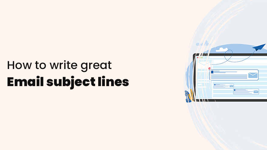
With all this competition, it is important to stand out. To stand out, the subject line is the most important factor in getting noticed in the inbox and getting the recipient to open your email. Once your email is opened, the design plays a crucial role.
The purpose of design is to:
- Present your message as clearly as possible
- Make your emails as easy to read as possible
- Get the reader to act on what you want
Clicks and conversions increase if your email newsletter is properly designed and has a great design. The key is that the reader likes what they see.
Why do I need to think about email design?
Email marketing is not just about the content of the email, but also about how the content is presented. A well-designed newsletter, promotional email, and other emails improve user experience and engagement and simply attract more customers.
Design plays a crucial role because it has a direct impact on how your emails are perceived and used and whether they achieve the intended goals, such as driving conversions, building brand loyalty, or conveying information.
When recipients see your email for the first time, their first impression can determine whether they will engage with the content. A cluttered or poorly designed email can deter recipients from reading the content at all, so you need to make a positive first impression.
Basic email marketing design
First impressions are very important in marketing, and emails are no exception. To give your email campaigns the best chance of success, it’s important that you understand and apply the basic design of your emails.
Whether you’re an experienced marketer or a beginner in email marketing, the following design concepts can help you create visually appealing and engaging emails that will get you the results you want.
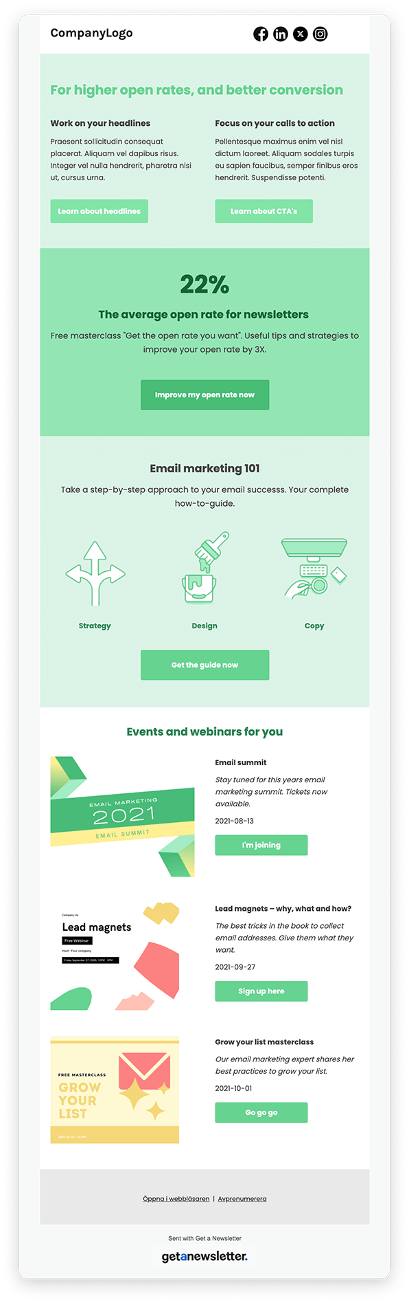
Visual hierarchy
Visual hierarchy is not as complicated as it may sound. It involves arranging your content in an order where the most crucial information is displayed first so that the reader can quickly understand your message.
You can create a clear visual hierarchy by displaying the most important content higher up in the email that you want the reader to absorb first.
Use larger fonts, colors, contrast differences, and strategic placement to draw attention to key elements such as headlines, offers, and call-to-actions (CTAs).
This ensures that recipients understand the flow of the message and can quickly find the most crucial information.
Layouts
As consumers, we tend to follow predictable patterns when engaging with content. Thanks to this, the design of your emails can capitalize on these tendencies and more easily capture the recipient’s attention and interest.
Different layouts not only make it easier to scan and understand the content of your email but also help the reader find the most crucial parts of the email.
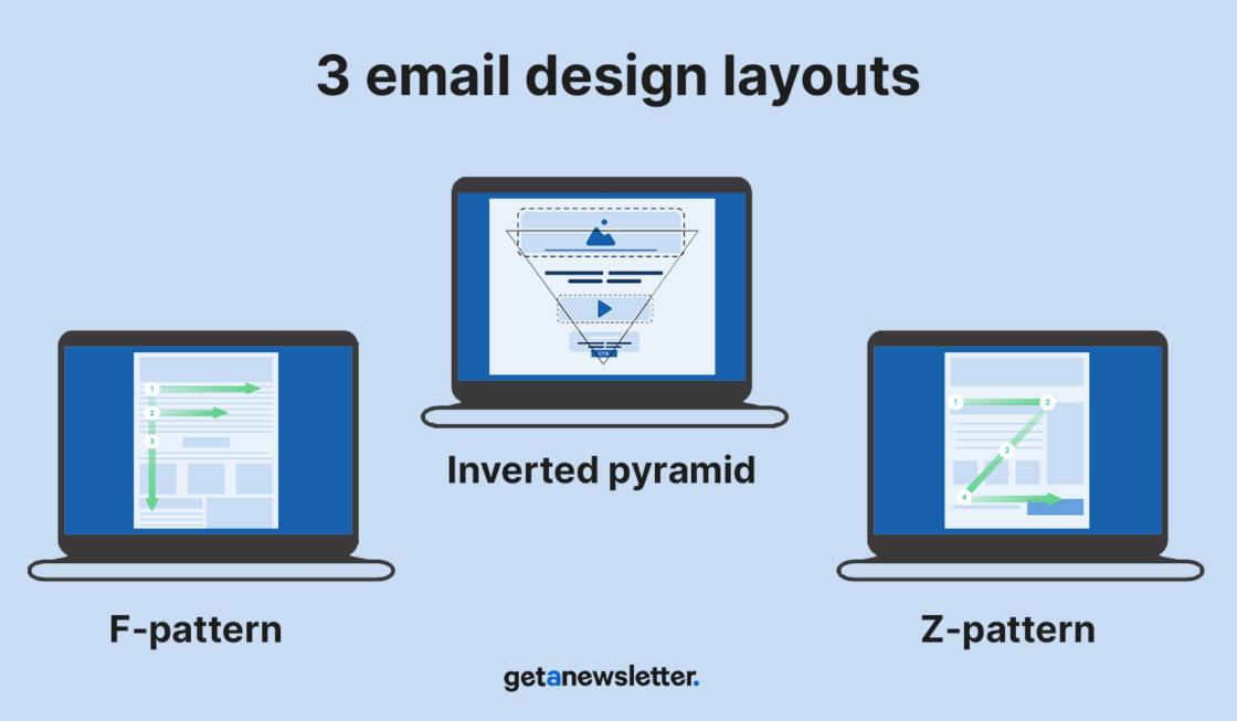
Let’s take a look at three different layouts that are well-suited for email marketing.
Z-pattern
The Z-pattern is an effective way to get recipients to read through all the content of your emails. This strategy is based on eye movement patterns. When we read from left to right, we tend to skip forward as we take in content.
As a designer, we can take advantage of this tendency by scattering eye-catching content throughout the text. This way, readers are less likely to get bored halfway through the text.
Inverted pyramid
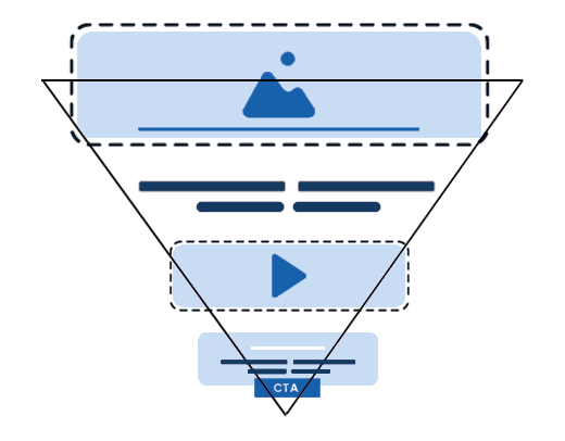
The second pattern is the inverted pyramid layout. As you can see in the example above, this layout works by grabbing readers’ attention at the top of the email before they focus on a call to action, specific information, or whatever the goal of your email is.
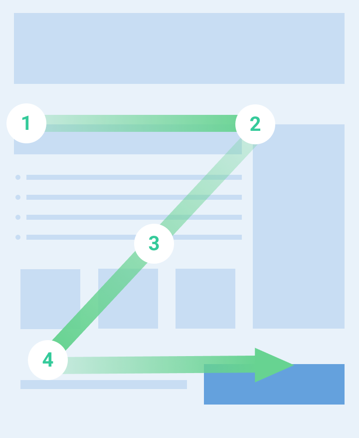
F-pattern
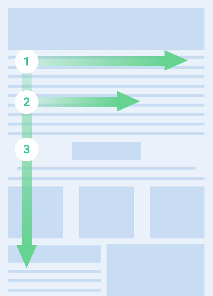
The third pattern you can try is the F-pattern. It is a common scanning pattern for emails with a lot of content and text. This pattern is based on the fact that recipients read the top lines more carefully but then skim the further down the text they get. Therefore, if you are using the F-pattern, it is important to place the most crucial information at the top of the email newsletter.
Using layouts suitable for email design does not automatically mean the email will engage and convert your readers. Just like with everything else, a balance must be struck. If not, your reader will be confused and, even worse, frustrated.
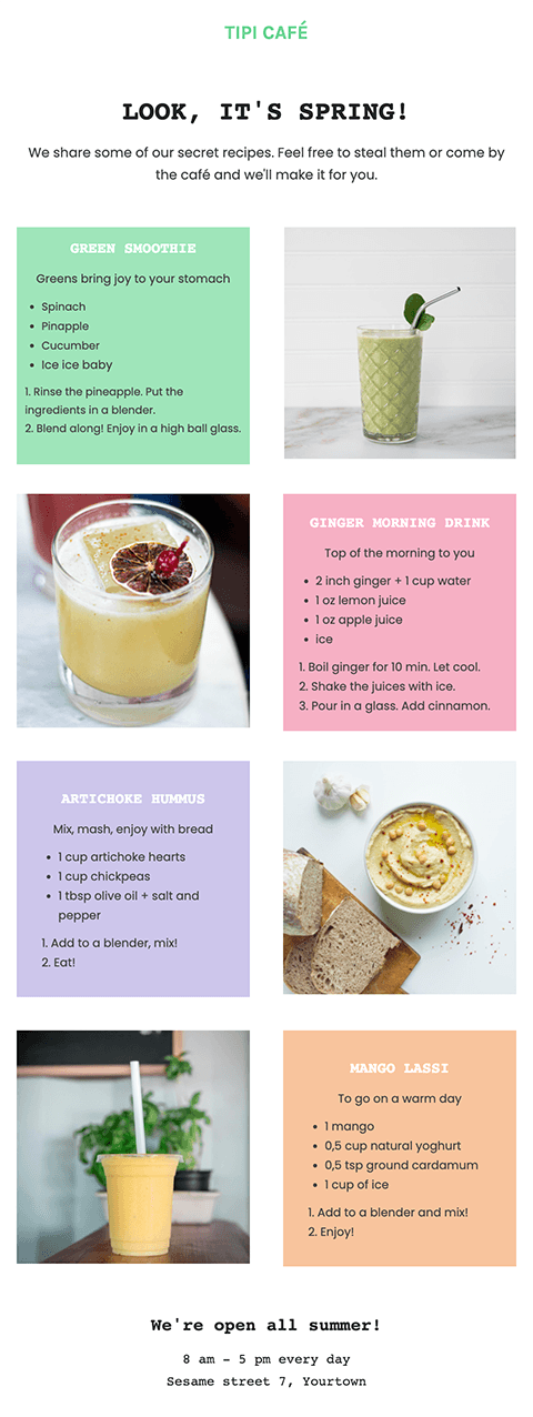
The relationship between text and image
Finding the right balance between text and images can have a large impact on how your message is communicated and received by your audience. An imbalance between text and image also doesn’t look very good visually to the eye.
A general formula you can follow is to use the 60/40 formula when designing your emails – that is, 60% text and 40% images. This formula works for most businesses but, as with anything, you should experiment with what works best for you and only use the formula as a starting point.
Remember that if an email consists only of images or has too little text in relation to the number of images, email programs (Outlook, Gmail, Yahoo, etc.) may perceive it as spam, resulting in your emails risking ending up in recipients’ spam.
Airy design for better readability
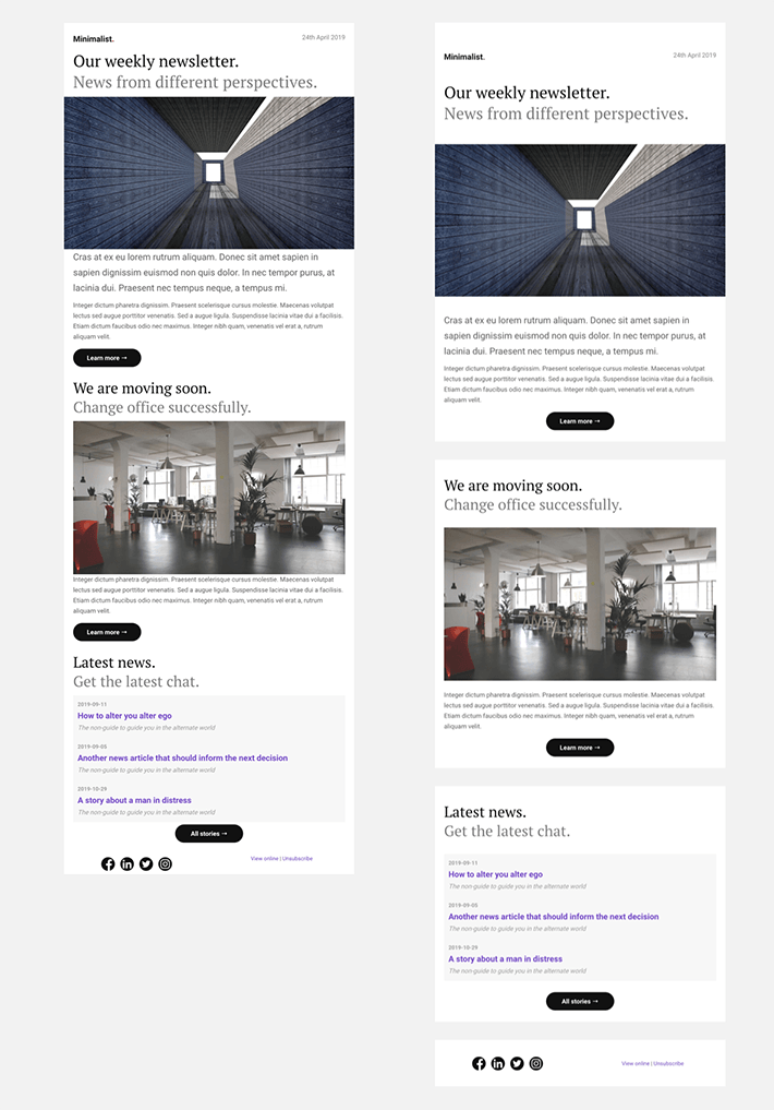
Right: Clear division between the sections and the content of each section has its own breathing space.
A common mistake many people make with their design for email newsletters and other email campaigns is to place content too close together. A simple way to create a professional impression is to give your content enough space. Also, make sure your text is appropriately spaced so the recipient can easily read your email.
A good rule of thumb is 1.5 (150%) for body text and 1.3 (130%) for headlines.
White spacing
Creating white or negative space is extremely important. It helps reduce visual clutter and makes your content more digestible. Sufficient white space improves readability, reduces eye fatigue, provides a cleaner look, and draws attention to crucial elements.
Be clear and concise
Most people have many emails to deal with every day or week. This means they do not have time to read long emails. While it may be tempting to include as much information as possible, you need to keep your emails clear and concise, so that you don’t lose your readers’ attention.
Introduce the topic of the email, tell readers what they need to know about it, and then use a call to action to conclude your email. Short texts are the way to go when it comes to email marketing.
Choice of color
There are many good reasons to use color in your emails. The main reason is that color evokes emotion, which leads to feelings that make your readers take action. Color in an email helps your readers understand the content, stay longer to read, and click on your buttons and links.
Choosing the right colors can be very challenging and time-consuming. If you already have an existing graphic profile, the job is quite easy, but starting from scratch can be much more difficult.
There are no rules when it comes to what you should color in your emails, but it is always good to keep your goal in mind when choosing colors and what should stand out. After all, you want to grab the recipient’s attention and keep them reading, right?
If you still want some sort of guideline when it comes to color, you can use the 60-30-10 rule. It’s a classic interior design rule that helps create a color palette for a space but works equally well as an email design guideline.
The 60-30-10 rule means that 60% of your email design should be a dominant color, 30% should be the secondary color or texture and the last 10% should be an accent that stands out from the rest.
Are you having trouble finding the right colors for your newsletter, promotional email, welcome email, or other email design? Visit Happy Hues or Coolors for inspiration and tips on creating great color combinations.
Some elements that are always suitable to customize the color of:
- Buttons
- Links
To organize your emails nicely, you can also customize the color of:
- Backgrounds
- Headlines
- Header
- Footer
- Separator lines
- Text boxes
Tip: Did you know you can use Get a Newsletter’s drag & drop editor to add all these different elements to your email? In addition, you only need to go in and choose colors for your basic design once, as all similar elements are controlled by the same setting. Talk about easy!
Contrasts
Another important part of your email is to use sufficient contrast. Not only is it important to emphasize the right parts, but it is also a key element to ensure that recipients with visual impairments can easily read your content. There are tools to make sure you meet the guidelines to reach the correct level.
Check out the Coolors – Color Contrast Checker tool to see if you are using sufficient contrast between different elements.
Customize for light and dark theme
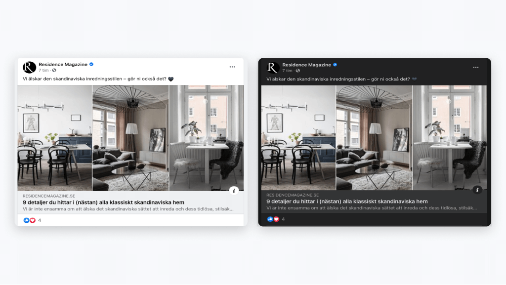
It has become increasingly popular for people to use a dark theme on their devices, which is something to be aware of when designing your emails.
A dark theme means you have a darker background and lighter text. As opposed to the more common lighter background with darker text.
Many people find that a darker theme provides a more pleasant light and that you can absorb the information easier as light text against a darker background is easier to read, as well as helping to increase the battery life of your phone.
Responsive design
Of course, you want your email design to adapt well regardless of the recipient’s device, email program, and screen resolution.
The design of an email is not quite the same as that of a website, although they are written using the same code (HTML and CSS). Emails have a few more limitations, and email programs do not share a common standard on how the code should be interpreted. Therefore, websites can look relatively similar no matter what device or browser you visit them from, while emails can be very different.
There is always a risk that your emails will look different in some email clients, and you should be aware of this when designing your emails. This is another reason why it can be good to use ready-made email templates, as these have been tested in different email programs and devices.
At Get a Newsletter, all email newsletter templates are responsive, which means they adapt to the screen on which the recipient is reading the email.
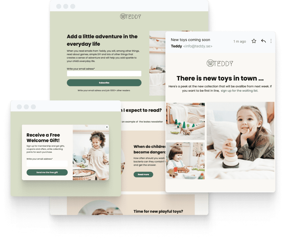
Header
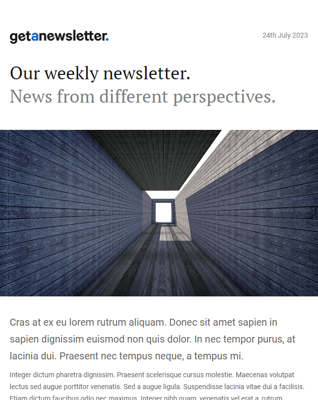
The key to a good header in emails is to keep it simple. If there’s one mistake many people make when designing their emails, it’s overdoing it.
The header is a great place to put your company name and logo. You can also include a subject line, date, and information about the user and recipient.
The important thing is that the header should not take too much focus from the actual content of the email, but it should be an introduction to the content so that the recipients get a clear idea of what it is about.
Branding
For most people, the main goal of email marketing is to strengthen your brand and build a list of subscribers interested in your products or services. Therefore, always include your company logo, colors, fonts, name, and anything else that helps strengthen your brand.
Also, don’t be afraid to use your brand’s voice and tone of voice in your emails. After all, you want your emails to sound like they’re coming from your brand, right?
Keep the brand consistent throughout your email campaigns to reinforce your brand identity. It creates recognition and trust among recipients, as they associate the design with your brand.
Font
The font used in the text of the email can also play a crucial role in its success. It can be tempting to use fancy web fonts to display your brand’s message. But what if it doesn’t load when sent to your potential customers? Unfortunate, right?
It’s necessary to use email-friendly fonts that appear on all screens and therefore, it’s a good idea to use system fonts. System fonts are not always pretty, but they can be used without having to load any font files as they are already on the device you are using.
Also, be careful not to use too many fonts. In most cases, a maximum of two fonts, one for headings and one for body text, will work. You will get very far with a few fonts if you use all the styles of each font. Try bolding, changing the color and size, and italicizing the parts of the text that you want to stand out.
Here are some guidelines to follow when it comes to fonts in email design:
- Simple, branded, and easy to read
- Maximum of two fonts in the whole email
- Sans serif fonts in body text for increased readability
- 18px to 22px for body text and 28px to 32px for headers
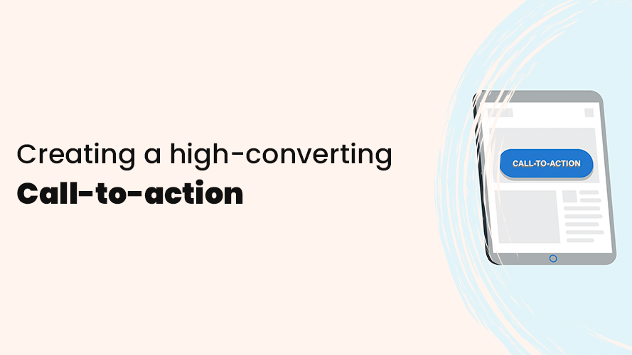
Call-to-action
A call-to-action (CTA) is extremely important for email campaigns and design and involves prompting the reader to an action. A short phrase in your email should prompt and motivate the reader to act and get the person to do what you want them to do. For example, to click on a button, link or image.
Here are some things to keep in mind when designing call-to-actions:
- Ideally, use one but no more than three call-to-actions in a single email.
- Buttons perform better than links.
- Strong colors on buttons and links perform better than neutral ones.
- Text should be clearly visible and large enough to attract attention, but not so large that it scares.
- Make sure there is a contrast between your call-to-action and other content to make it stand out from the rest of the mailing and grab attention more easily.
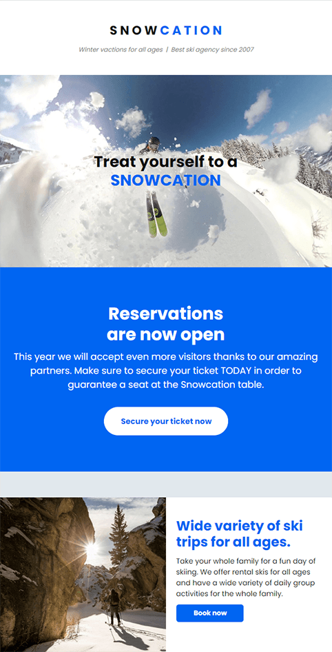
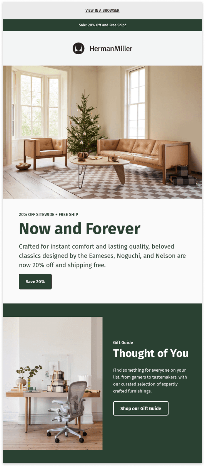
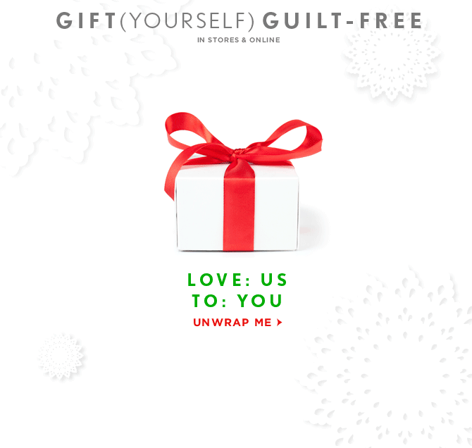
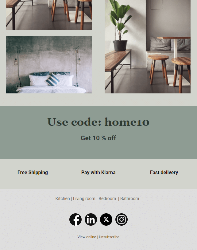
Images
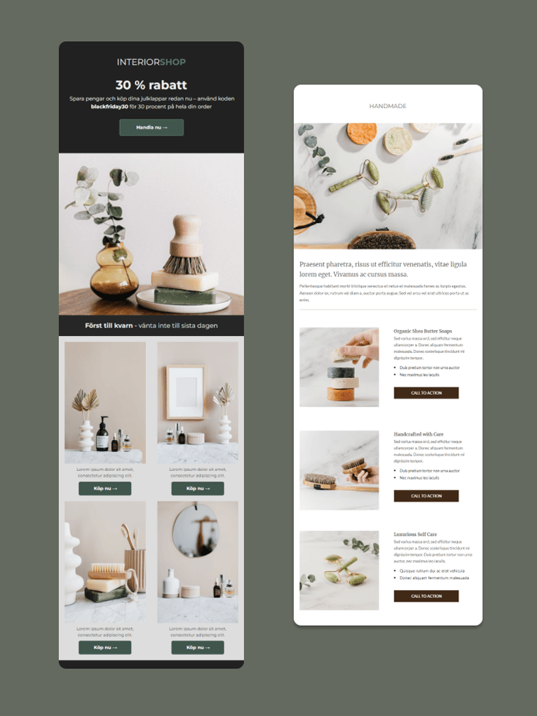
There is no doubt that images are one of the most crucial elements when it comes to designing emails, especially for those who have a store or e-commerce and are likely to send emails with images of your products.
In these cases, the images will be the main focus and require a greater focus on image selection. It is for this very reason that image-focused templates are popular.
Images capture attention better than text, provide more information than words, and generally stick with people long after the words have disappeared. However, using them in the incorrect way can have the opposite effect and discourage your readers.
Don’t forget to keep a good balance of images and text, even if your emails are image-based.
Here are some things to keep in mind when working with images:
Use high-quality images
As images help reinforce the emotions and messages you want to convey with your emails, they should be carefully selected and of high quality.
When it comes to images, you may want to keep a few things in mind:
- The recommended width for an image in an email is around 640 pixels.
- For smaller images such as icons or logos, it is recommended that you include an image twice as large as intended to appear in the email. If the image is to be displayed 40px wide, insert an 80px wide image – this will give you a better resolution of the image.
Some email programs will block images and instead display emails in a simple text mode. In this case, it is good to make sure the email also works and looks good without images. Therefore, check how your emails look in text mode.
Also, don’t forget to add ALT texts to any images you insert in your emails. ALT text is an alternative text that appears when an image file cannot be loaded or when people use screen readers to read your email. It ensures that your message still gets through, even if the design of the email is not fully displayed.
Simply write a few words that summarize what the image contains.
- To ensure the same experience for all recipients, include a link to the email for the readers to open in the browser. It helps the recipient to read the email as intended in the unlikely event that it looks weird in the email program.
A link is automatically included if you use a pre-made email newsletter template at Get a Newsletter.
Avoid images with large file sizes
Large, high-resolution images take longer to load, and loading times directly affect recipients’ patience for the images to finish loading. It will be particularly noticeable for recipients located somewhere with poor connectivity.
Therefore, avoid using images with too large file sizes and keep all of your images below 1MB in image size, preferably as small as possible, without affecting the image quality for the human eye to detect.
If you want to reduce the file size of your images, you can use, for example, Adobe Photoshop, Figma, or a free online tool to compress your images.
Each image should have a purpose
A good way of thinking is that every image should have a purpose. Therefore, do not add images just for the sake of it. Every image should have a strategic purpose that reinforces the message you are trying to convey. If an image does not add value, it is better to leave it alone.
This way of thinking also helps you with what we have covered earlier. It helps avoid including unnecessary images that make the email take longer to load and minimizes the risk of your emails being flagged as spam and ending up in the recipient’s spam folder.
Examples of images that often serve a purpose include high-quality photos of your products or related to your services, explanatory information graphics, or highlighting an employee.
Use of GIFs
GIFs are valuable when it comes to standing out with your emails. A GIF is an animation of images without sound that repeats itself. Movement instantly attracts attention and brings the content to life, making it more engaging.
In addition, GIFs work in most email programs, unlike video.
It’s a good idea for the first image in a GIF to stand on its own. It is important because if your GIF can’t be shown to certain recipients, it’s the first image in the GIF that will be visible.
Why is it better to use a GIF instead of a video in an email?
Because it is not possible to play videos in most email programs. They simply do not support the functionality and therefore it is not recommended to insert video as a file directly into your email.
What you can do instead is to refer to a selected video via a link in your email and thus reach out with your video to your subscribers.
Tools & inspiration for your images
There are a lot of tools and websites that can help you make the most of images for your emails.
Image banks
Creating and using original images is ideal when you want to promote your brand and messages in the way you want. However, creating images on your own is not always easily accessible to everyone, so images from image banks can be a good alternative.
Keep in mind that there are a lot of low-quality images on image banks that are unnatural and will not fit your brand well. So make sure you take the time to find images that suit you, and you should also check that your competitors are not using the exact same images or something too similar.
Here are a couple of websites where you can find and use images for your emails:
Image creation tools
If images from image banks don’t quite work for the specific email campaign you’re trying to create, there are tools to help you create the perfect image.
Some of our favorites are:
- Canva – The tool includes thousands of stylish stock images for you to edit and easily add other elements – for example, texts, banners, frames and buttons.
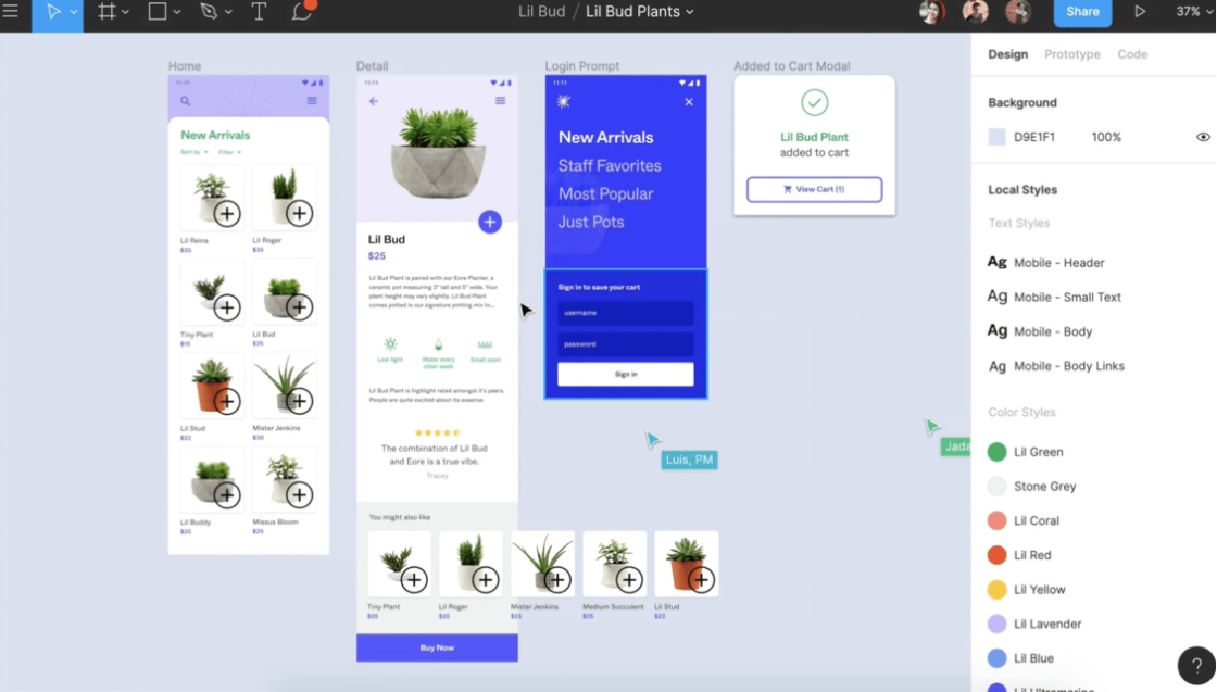
- Figma – Figma is one of the world’s most popular design tools that works directly through a web browser. It also has a collaborative design feature that makes it easy for multiple people to work together in real-time on the same project.
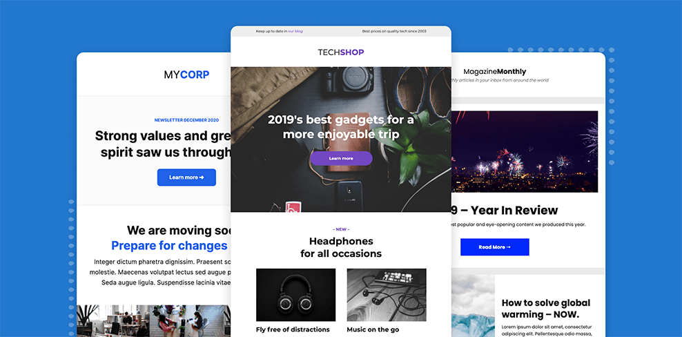
Design inspiration for email newsletters and other email campaigns
There are quite a few email galleries that might be worth checking out. These websites are full of design inspiration for newsletters, promotional emails, welcome emails, and other types of emails. In these email galleries, you can search by category, free text, or scroll until you find something you like. If you need inspiration for a specific theme, such as Black Friday or Easter, you can search for it.
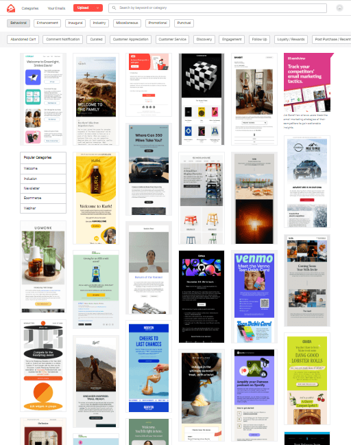
- Really Good Emails – One of our personal favorites that is constantly updated and has great filtering options.
- Email Love – A modern site that offers designs in a variety of categories, trends, and special occasions.
- Email Gallery – An easy-to-navigate site where you can find lots of inspiration and also filter on elements such as colors and number of columns.
- EmailsFresh – Over 800 examples of great-looking emails based on different categories and industries.
- Email Newsletter Examples – Another great site where you can find everything from welcome emails to birthday emails.
- Email Design Inspiration – Here you can rank by “top-rated” and get a feel for what’s popular.
Footer
The footer is a place many people don’t think much about or don’t use to its full potential. The footer of an email is just as important as the other elements as it provides space to place additional information that may not fit well in the email itself.
Readers often look in the footer for information that can be used, for example, contact details and social media profiles. It should also include a link to unsubscribe from receiving future emails from you.
Therefore, make sure to create maximum benefit from your footer and keep it simple and concise. In addition to placing the unsubscribe link, social media links, and contact information, you can be creative and use the space for more things.
For example:
- Unique selling point
- Core values of the brand
- Company logotype
- Location of store
- Coupon code
How Get a Newsletter simplifies your email design
Pre-made email newsletter templates
Creating a new email design every time you send a new email is very time-consuming, and your emails might not follow the same theme. This is where pre-made email templates come into play.
At Get a Newsletter, you can access email newsletter templates that will help you save valuable time and give you inspiration. All you need to do is rearrange the content based on what you decide is most important in your emails and then add your own logo, fonts, colors, and images.
Explore and use Get a Newsletter’s email newsletter templates to save time and get started quickly with your email campaign!
Drag & drop editor
Creating and designing an email shouldn’t be a hassle. Thanks to our user-friendly drag & drop editor, you can easily design your newsletters and customize your templates without any prior technical knowledge of email design.
With the drag & drop editor, you can add texts, images, videos, and other content blocks without any previous knowledge of HTML. For the more advanced users, you’ll also find an HTML block that gives you even more control over your design!
Read more about Get a Newsletter’s drag & drop editor.
Getting started with your email design
Hopefully, you’ve gained a deeper understanding of why email design is a crucial part of email marketing and how it can affect your bottom line.
So what are you waiting for? Now it’s time to start getting creative and working on your email design. If you want to get started with your email design at Get a Newsletter, you can create a free account to see if the tool is right for you and your business.
Plus, you’ll find landing pages, surveys, signup forms, and much more at Get a Newsletter!
Get started with email marketing
Start creating & sending email newsletters for free with Get a Newsletter to easily reach your subscribers and customers.
Keep reading
11 minutes
10 minutes
9 minutes
Get started for free
Explore newsletters, landing pages, and surveys. Market your
products and services. Increase your sales and customer loyalty.