Get a Newsletter
Email marketing made simple
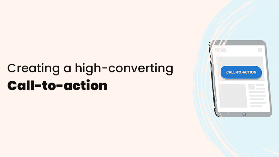
How to create a
Call-to-action that convert
Find out why call-to-actions are crucial to converting more customers and how you can improve your own with practical tips.
When it comes to email marketing, every email should have a purpose. Whether it’s informing your subscribers about your latest offers and product updates or getting them to visit your website, every email campaign should have a primary goal.
You can’t leave your readers guessing what you want them to do after reading your email – this is where your call-to-action comes into play. It has the task of leading your readers in the right direction towards your primary goal.
In this section, you’ll find everything you need to know about creating call-to-actions that convert your customers and why they are so important. You’ll also get several great examples of what they can look like in reality.
What is a call-to-action (CTA)?
A call-to-action (CTA) is a button or link that calls readers to action. That is, to do what you want them to do – for example, to buy a product, sign up for a course, register for a service, read a blog post, and so on.
They have a clear purpose directly linked to some kind of conclusion and therefore need to be direct and concise to clearly show what the next step is for the reader. Call-to-actions are one of your best tools in email marketing to create engagement and help you get more clicks, conversions, and thus a better result.
Why is a call-to-action important in email marketing?
As mentioned earlier, every email should have a goal – to get more purchases, signups, traffic to your website, and so on. To achieve this, you need to get your subscribers to leave their inbox and go to another website.
That’s why a call-to-action is very important because it’s the last action your subscribers need to take in your email and leads them to where you want them to go. A good and clear CTA also leads to more clicks and conversions. Precisely because it attracts the reader’s attention better and clearly shows the value of the click.
Types of call-to-actions
Every email you send should generally have a primary goal, but that doesn’t necessarily mean you need only one CTA. Sometimes you may have several possible actions that your subscribers can take in your email and, then these call-to-actions can be divided into two different categories:
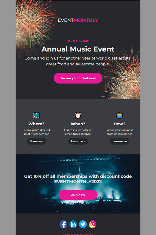
Primary call-to-action
Your primary call-to-action is the main action you want your subscribers to take. It should be the most prominent in your email and designed in a way that helps it stand out from the rest of the content.
One way to help your primary call-to-action stand out better is to use white space around it. It will help draw attention to your call-to-action and reduce visual clutter.
You can also make primary calls-to-actions stand out more by:
- Designing your primary CTA as a button
- Make the button a different color that stands out from the rest of your content
- Using typography such as bold and larger text
- Place your primary CTA early in your email to increase the chances of more readers seeing it. If you place it further down, you run the risk that not everyone will see it, as not all your subscribers may read the whole email.
Secondary call-to-action
Your emails may contain more than one action and require using multiple call-to-actions – this is where secondary call-to-actions come in.
Secondary call-to-actions should be designed in a less attention-grabbing way to avoid confusion and put your primary CTA in focus.
To avoid your CTAs competing with each other, consider not placing your secondary call-to-actions as prominently and avoid using bright colors that grab attention easily.
An easy way to differentiate between your primary and secondary CTAs is to adjust the size and use colors that blend in with the rest of your content. This way, your primary call-to-action still stands out from the rest of your content, and your secondary call-to-actions are not in focus.
Where should I place my call-to-action?
There are a lot of different types of layouts that affect the number and placement of your call-to-action. Regardless of the email layout, your CTA needs to be visible and placed in the most prominent position in your email.
With that said, let’s go through some tips that can help you with the placement of call-to-actions in your emails:
- You can place your primary CTA at the beginning of your email to create immediate visibility for your desired action as long as it clearly states what it is about.
- You can also place it at the end of your email so readers can absorb your whole message before choosing to act.
- If you use multiple call-to-actions in your emails, you should place them next to relevant content.
- Place your call-to-actions in places where it will be natural for readers to pause – for example, at headlines, captions, and the end of paragraphs.
- Use secondary call-to-actions in the body text or subheadings to avoid them taking focus away from your primary CTA.
- If your email has only one CTA, the placement should follow the logical order of your message.
For example, if you want to collect signups for an event, you want readers to find your call-to-action after reading about the event and not before, as there is no point for your subscribers to sign up for something they know nothing about.
Tips on how to create the perfect call-to-action
It’s not quite that simple to just add a CTA button and assume it will work well. That’s why we’re going to walk through some tips you should keep in mind to help you be more successful when designing and writing your call-to-action.
Copy-related call-to-action tips
Use action-oriented text
We mentioned earlier that a CTA should be a call to action – to get your subscribers to do what you want them to do. Make sure your text reflects that and is action-oriented.
While this may work, you should avoid using boring words like read more, click here, submit, sign up, buy now, shop now, and so on.
Instead, you should combine these actionable words with text that relates to your specific offer and shows the value it provides.
Here are some examples:
- Get 40% off
- Try the service for free
- Reserve your spot
- Buy now and get free shipping
- Check out our summer collection
- Share your feedback
- See your personalized plan
Font size
The font size of your CTA buttons should be large enough to be easily readable and visible but not excessive. Make sure the texts are big enough to grab the subscribers’ attention but not so big that it discourages them.
Keep it brief
A call-to-action is most effective when it explains, in the shortest possible way, what value it brings to readers to click on it. Depending on the font size in your CTAs, you may need to consider the number of words you use – this becomes more important the larger the font size you use.
Regardless of the font size, try to stick to 3-5 words and certainly no more than 6-7 words.
Create a sense of urgency
If you have a time-limited offer, you can use it in your emails to increase the sense of urgency for your subscribers to take advantage of your offer. In general, people don’t like to miss out on things, especially when it comes to limited-time e-commerce offers that many people can relate to.
Here are some examples of texts with urgency:
- 40% off today only
- Shop before 8 pm and get free shipping
- Reserve your spot – 6 spots left
- Your offer is valid until 22.00
- Take out a subscription today – get one month free
Design-related call-to-action tips
Color and contrast
The choice of color for your call-to-actions is important. You should use a color that stands out from the surrounding content and attracts attention without being too distracting.
Also, make sure that the color you use matches your brand. For example, wouldn’t it be wrong for McDonald’s to use a green CTA button instead of a yellow or red one?
You should also make sure that the color stands out from the background and text colors to create a good contrast. Your goal should be to use a color that goes well with the rest of the content and is also the most obvious color your readers will see when they read your email.
Size of the CTA button
You need to find a balance for how big your CTA buttons should be. There is no right or wrong way to size your CTA buttons. Use common sense and find that balance for your specific email design.
Your CTA buttons shouldn’t be so small that they don’t stand out but at the same time, they shouldn’t be overly large either to put readers off and don’t look good with the rest of the email design.
Use white space
An easy way to make your call-to-action stand out more is to use white space around it. It creates a visual break from the rest of the content and draws the reader’s attention to where you want it to go.
When you use white space around your call-to-actions, you also make it easier for subscribers who read your email on their mobile. It provides an easier surface for their fingers to click on, which can sometimes be an issue if other content is too close to a CTA.
Keep track of your other content
It’s not only call-to-actions that can grab attention, but other content such as images and large texts can also do so. You should make sure they do not distract your readers from clearly seeing your primary CTA.
As your goal in most cases is to get readers to click on your primary call-to-action, you should make your other content fade into the background. For example, you can make your secondary call-to-actions less colorful, adjust the color strength of images, adjust text sizes, and work on the placement of your CTA if the other content takes too much focus from your primary call-to-action.
Great call-to-action examples
So far, we’ve covered some copy and design-related tips on how to create a good CTA. Now we’ll show you some great examples of what call-to-actions can look like in real life.
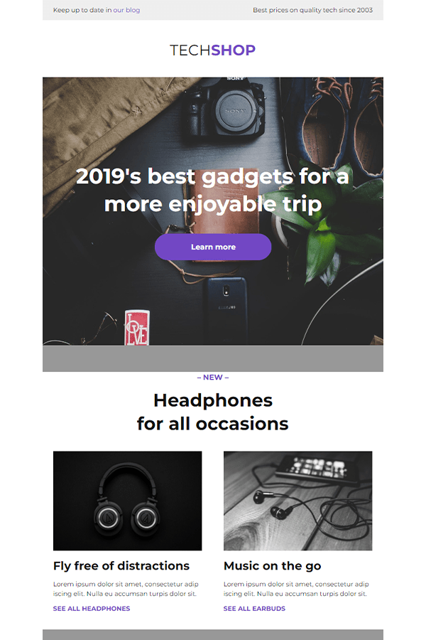
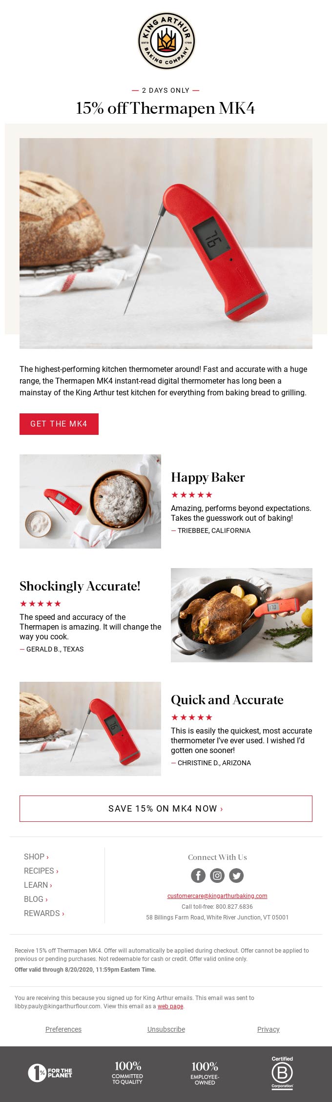
In the first example, Indeed, a service for job seekers uses a clear primary call-to-action in blue color that stands out and leads readers to a guide on “8 do’s and don’ts of your CV”.
Below, they continue to link to career advice articles via secondary CTAs that don’t take the focus off their main objective but are visible enough to grab attention and deliver extra value.

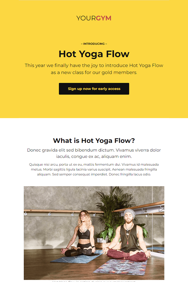
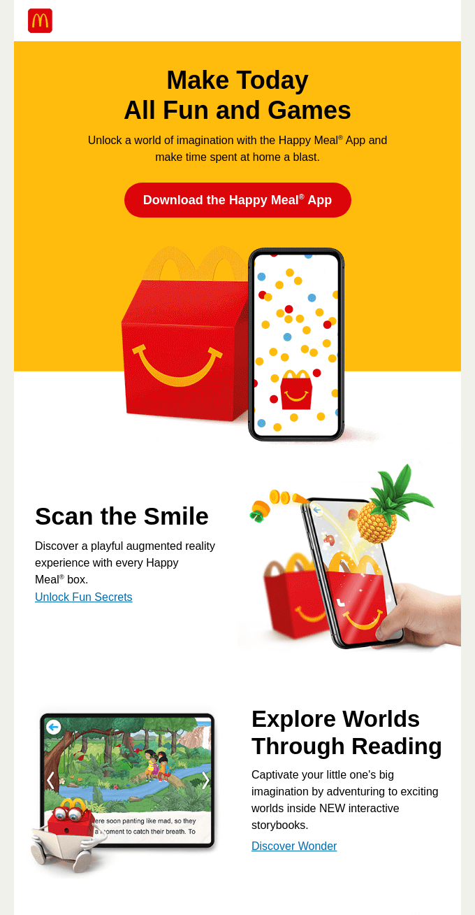
The newsletter from McDonald’s follows a similar path and has the purpose of getting readers to download the Happy Meal app. They use a clear call-to-action that also shows what readers get from clicking the CTA button.
Further down, they show content on what readers can expect to see in the app and use secondary call-to-actions in the form of link texts that tell more to those who are interested.
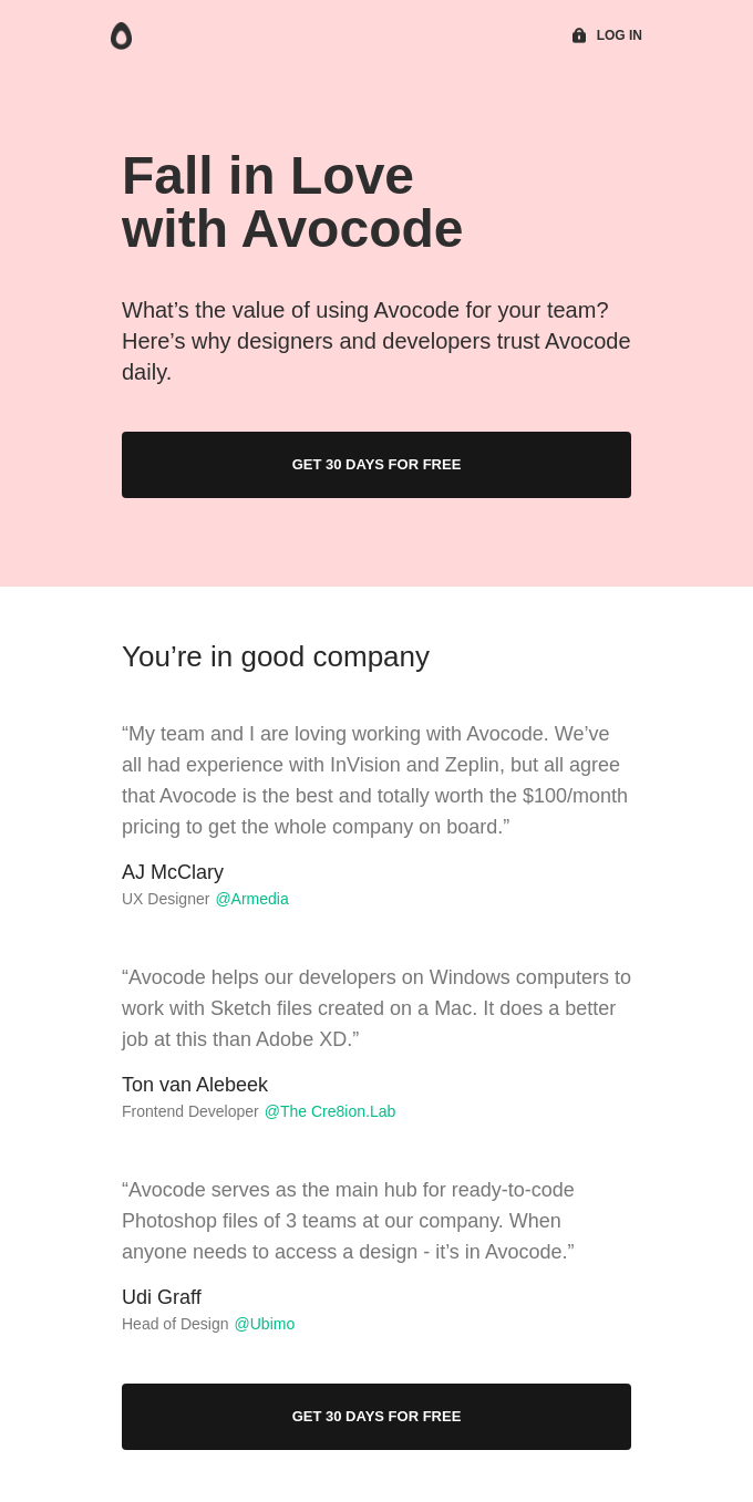
A concise newsletter from Avocode offering their subscribers to try their service for free for 30 days and using social proof from their current customers to show the value they are missing out on by not using the service.
Avocode uses the same CTA button twice, leading to the same main goal that clearly explains what readers get from clicking either button.
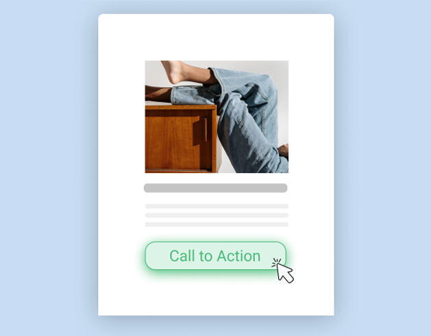
The last example from Blume is short and concise but is still as effective as the other examples above. The newsletter has only one CTA that clearly shows what they want their subscribers to do and also removes any distractions that could have occurred if they had more content and more call-to-actions.

Get started with email marketing
A strong call-to-action is powerful on all levels. Verbally, with a text and purpose that evokes emotion. Visually, with a design and placement that immediately grabs the reader’s attention and leads them where you want them to go. CTAs help your customers take action, whether your goal is to sell more or convert more.
You can read the next part of the guide on creating great subject lines that get you higher open rates or get started now with Get a Newsletter’s free plan and start designing and writing better call-to-actions in your emails.
Get started with email marketing
Start creating & sending email newsletters for free with Get a Newsletter to easily reach your subscribers and customers.
Keep reading

9 minutes

6 minutes

Get started for free
Explore newsletters, landing pages, and surveys. Market your
products and services. Increase your sales and customer loyalty.