Want to hear some *good* news for a change?
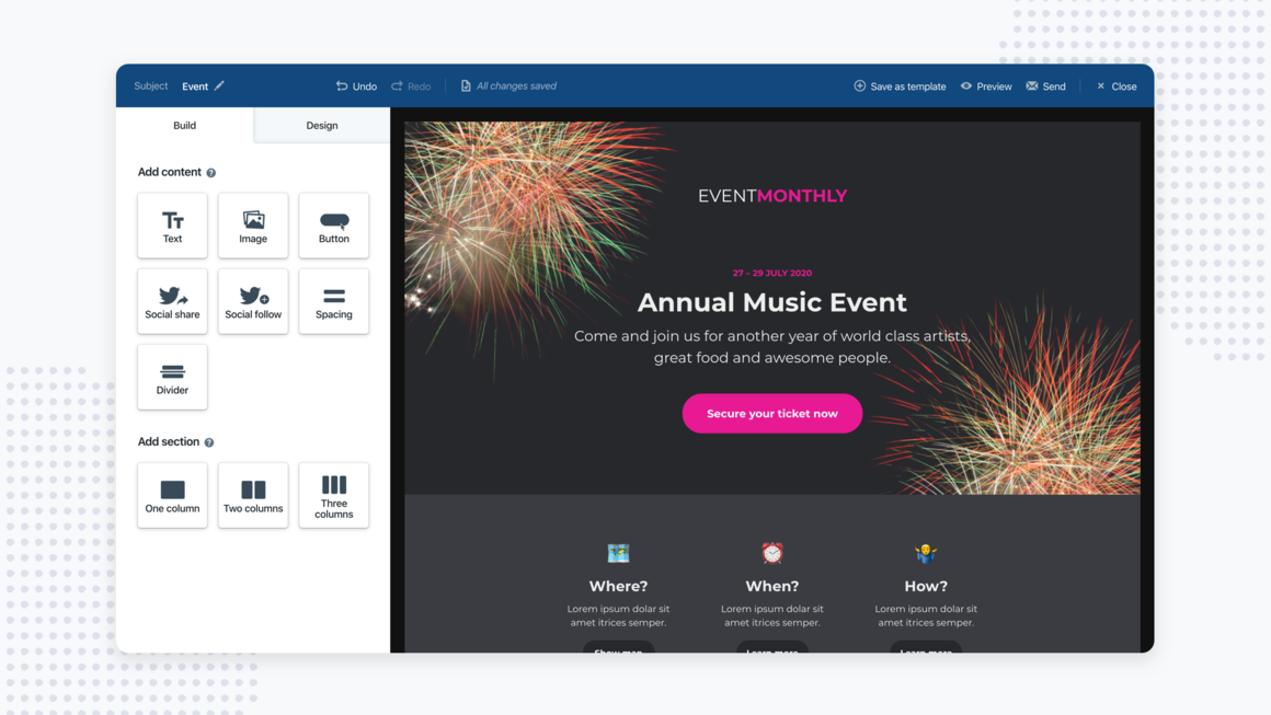
We just made creating stunning newsletters even easier – with our new improved newsletter editor!
After months of sketching, coding, and testing. The beta version of the new newsletter editor is finally here – and it has never been easier to create stunning newsletters.

The new version allows you to add different types of content blocks easier – so you can create a stunning newsletter with even less effort!
Let’s find out how.
Fewer content blocks = simple, powerful, and flexible
The first thing you’ll notice is that there are fewer content blocks. There is no longer a separate block for headings, text with a background, or three images in a row.
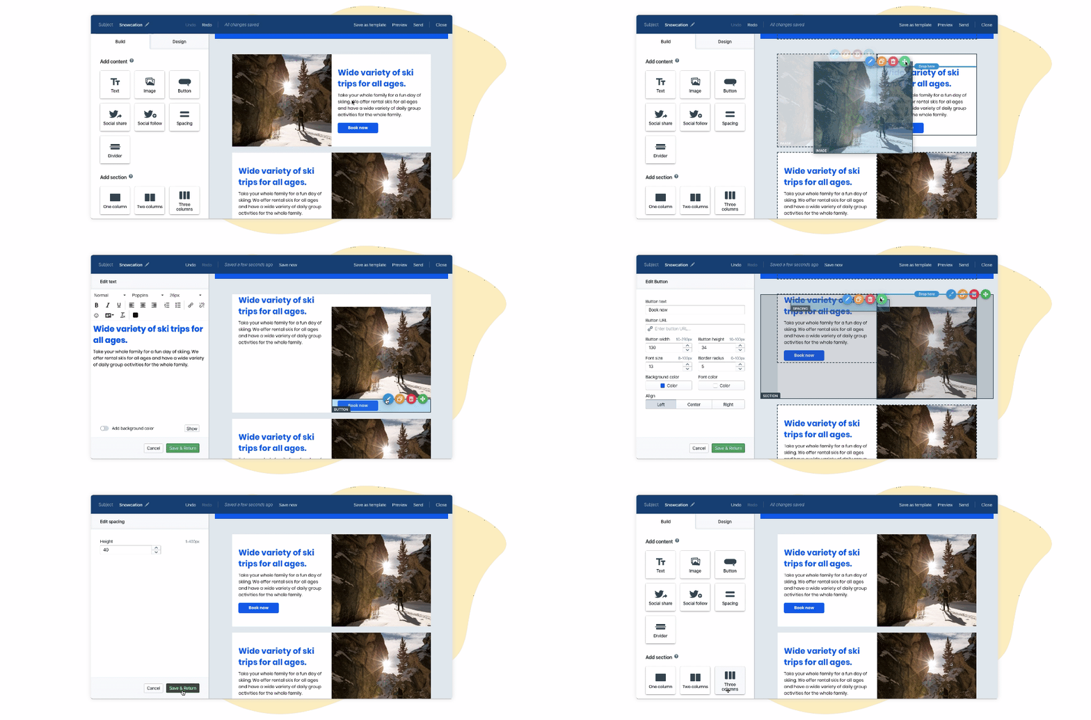
Fewer blocks allow you to be more flexible with the design, and how you can add or move your content around – without interrupting your workflow.
Now you can also move the images around easily – without adding a new image block. Simply drag the image wherever you want!

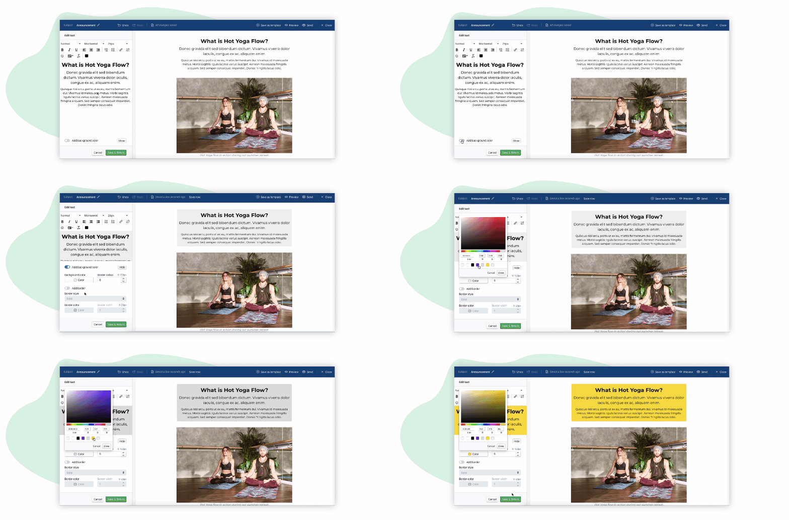
If you want to add background color to your text – you can just add it to the existing text block:

Nice and easy, right?
What else is new?
The blocks are just the start!
Here are some of the new features that will improve the design of your newsletters even more:
- Adding background images
- Full-width-images- everywhere
- Moving or copying parts of your newsletter
- 20 new fonts
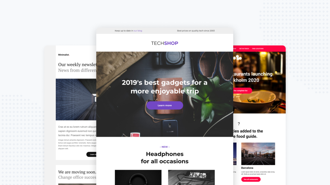
- 8 new pre-designed templates

Try the new newsletter editor NOW!
Go to “Mails” and click on try now to get access to the newsletter editor.
Leave a Reply