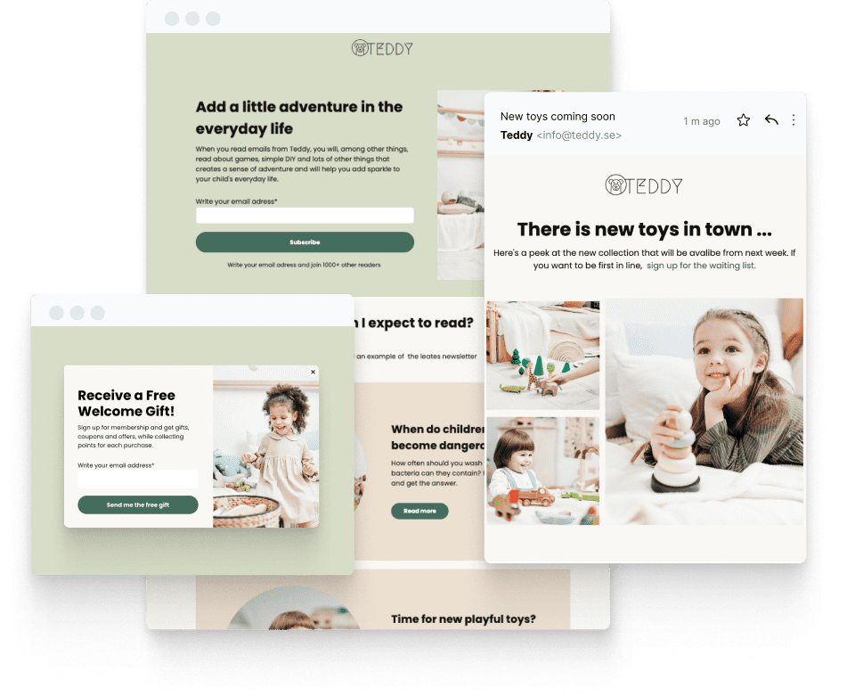
CTAs are “calls to action”, and the difference between good ones and bad ones makes and breaks email campaigns. Why are CTAs so important? Because it’s your call to action that prompts somebody reading your newsletter to engage or interact with you.
If there’s no call to action, then your email is a dead end. Your subscriber receives it, reads it … and then what?
Everything else is a means of promoting the desired action. So you start with the CTA and build the rest of the email around it!

In this blog, we’ll go through the most important factors to consider when producing email calls to action and provide top tips for killer CTAs.
Table of Contents
2. Where should I put my CTAs?
6. Testing my CTAs’ performance
1. How many CTAs to include?
Studies have found that emails that include at least one CTA generate 371% more clicks and a staggering 1617% more sales than emails that don’t include any.
But should you include more than one?
For most newsletters, the answer is NO.

Of course, you can include multiple links going to the same destination in the same email (eg one in a button, one in the text, and one on an image).
There are a few cases where multiple calls to action might be appropriate though.

In this example, Ruche is promoting just one action: visit their sale page. But they’re helping users to narrow down their preferences by directing them towards different sections relating to particular products.
Multiple CTAs can be helpful to personalize your content and make it more relevant to a wider range of users.
2. Where should I put my CTAs?
Again, there is no single right or wrong answer.
You want the greatest number of people to see it, so that would usually direct you to put it “above the fold” near to the top of the message so that a user doesn’t have to scroll down to see it.
That’s fine if the action you’re asking readers to take is simple and easily understood.
But if they’re going to need an explanation or evidence before they can be expected to click through, you are better off putting it at the bottom of the email.

3. Ensuring my CTAs stand out
Your calls to action should draw readers’ attention to them and make it very obvious that you are asking them to click there.

In the example above, Dropbox has made the CTA very prominent:
- By presenting it as a button. People are used to clicking on buttons so the “click here” message is conveyed implicitly.
- By putting the CTA in a contrasting color. The contrast makes it leap from the screen. Pick a color that stands out and has the best psychological connotations for your product.
- By using whitespace around the CTA to draw the eye to it.
There are other things you can do. Some newsletters include arrows pointing to the CTA or even make it impossible to ignore with tricks like this:

4. Choosing the right words
The language you use in your CTAs is critical.
Use “power words”
Some words tap into human psychology to promote positive feelings or to motivate action.
Terms like “Get started“, “Yes, I sign me up!“, “Start Your Journey” all works in this way.
Write first-person CTAs
It’s easier for a reader to imagine themselves performing the action/getting the benefit if your CTA talks directly about and to them.
Always phrase your CTAs using “I” or “me” (eg “Send me my free report“) for maximum impact.
Create urgency and FOMO
Words like “now”, “exclusive”, “ends soon” etc create a strong incentive to click through rather than come back to the email later.
Generate a sense of urgency or Fear Or Missing Out (FOMO) with these trigger terms.
Keep them short
Make it really obvious what you want readers to do by writing simple, short CTAs.
The fewer words you use, the more impact your buttons will have!
But avoid “click here”. It’s boring, it’s over-used and it doesn’t explain by itself what clicking here does.
5. Optimize for all devices
In 2019, 42% of all email opens came from mobile devices.
If you aren’t optimizing your newsletters for both desktop and mobile formats, you’ll miss out on a lot of clicks.
So here are a few tips on email CTAs for mobile:
- Mobile screens are smaller and narrower than desktops and are typically portrait-aligned rather than landscape.
- Use shorter CTAs to fit on one line where possible.
- The fold is higher up, so if you want your CTA above the fold it will need to be right at the top of the email.
- As a rule, people spend less time reading each on mobile, so produce a cut-down version with a prominent early CTA wherever you can.
- Mobile gives you the opportunity to include a call extension – a CTA that telephones you directly from the user’s device. Don’t ignore these!
6. Testing my CTAs’ performance
Best practice advice only goes so far. Real-life evidence is better by far.
You’ll only find out what makes the best CTAs for your business by testing.
This doesn’t have to be difficult or complicated. You can use a simple matrix like this to try out different theories:

An A/B test compares the performance of two variables against one another. It’s important to minimize all other differences between your test messages except for those variables or else the test results are less reliable.
You’re now ready to write killer Calls to Action!
Create a free account
Create beautiful email newsletters, landing pages, surveys, and much more with Get a Newsletter.

Leave a Reply