Great email opt-in forms are what determine your success in collecting your newsletter subscribers. Think for a moment about the last time you signed up for a newsletter on a website. What convinced you to opt-in for the newsletter?
A great (or funny!) call-to-action, a promise of value in the content, professional design of the opt-in form, a photo of the person whose newsletter you were signing up for, or maybe the GDPR fields ensuring your privacy?
There are a lot of factors that affect how successful your email opt-in forms are – and whether people will leave their email with you or not.
Now that you know you know all the ways you can promote your email opt-in forms to attract potential subscribers – let’s focus on nailing the opt-in forms themselves!
Great copy and Call-to-Action
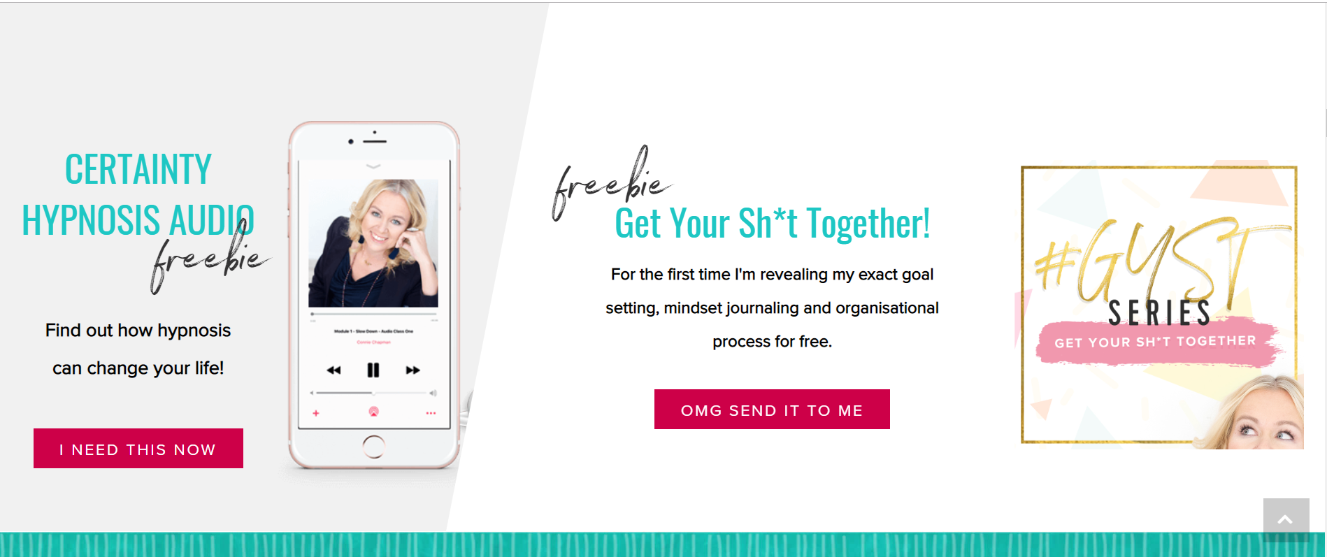
First of all – it’s not all about design. While the design may play a big role in attracting leads to your opt-in form – what ultimately converts them is the value proposition in the copy of the email opt-in form:
Newsletters opt-in forms mostly promise good content after you signup, so if the opt-in itself is not well written how can I expect the content coming after to be well written?
– Arsalan Sajid, Startups & Agencies Community Manager at Cloudways
What makes a great copy of your opt-in form?
- Show you know your target audience
- Show you understand your target audience’s pain points and needs
- Have a catchy CTA (Call to Action)
- Show your personality – use the kind of language that screams ‘YOU’ and resonates with your ideal clients. Don’t be afraid to polarize people – as Steve Jobs used to say – “if you want everybody to like you, sell ice cream”
Show you know your target audience and understand their pain points and needs
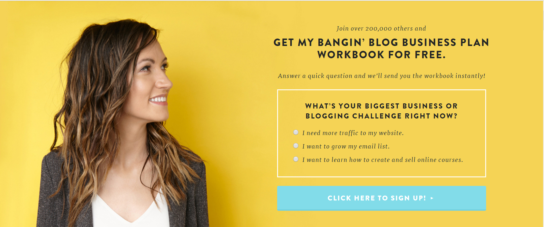
As you can see from Melyssa Griffin’s, a million-dollar blogging coaching business owner, email opt-in form, you can acknowledge your audience’s different needs straight in the opt-in form: by simply asking them what they want.
This also helps you instantly segment your newsletter audience by their interests – to make sure you deliver as much value to them in your newsletters as possible.
Have a catchy CTA (Call to Action)
You can show your personality in your CTA – using plays-on-words, making it a bit cheeky, or even using a stronger word (like in Susi Kaufer’s from Dream Life Deluxe’s example):
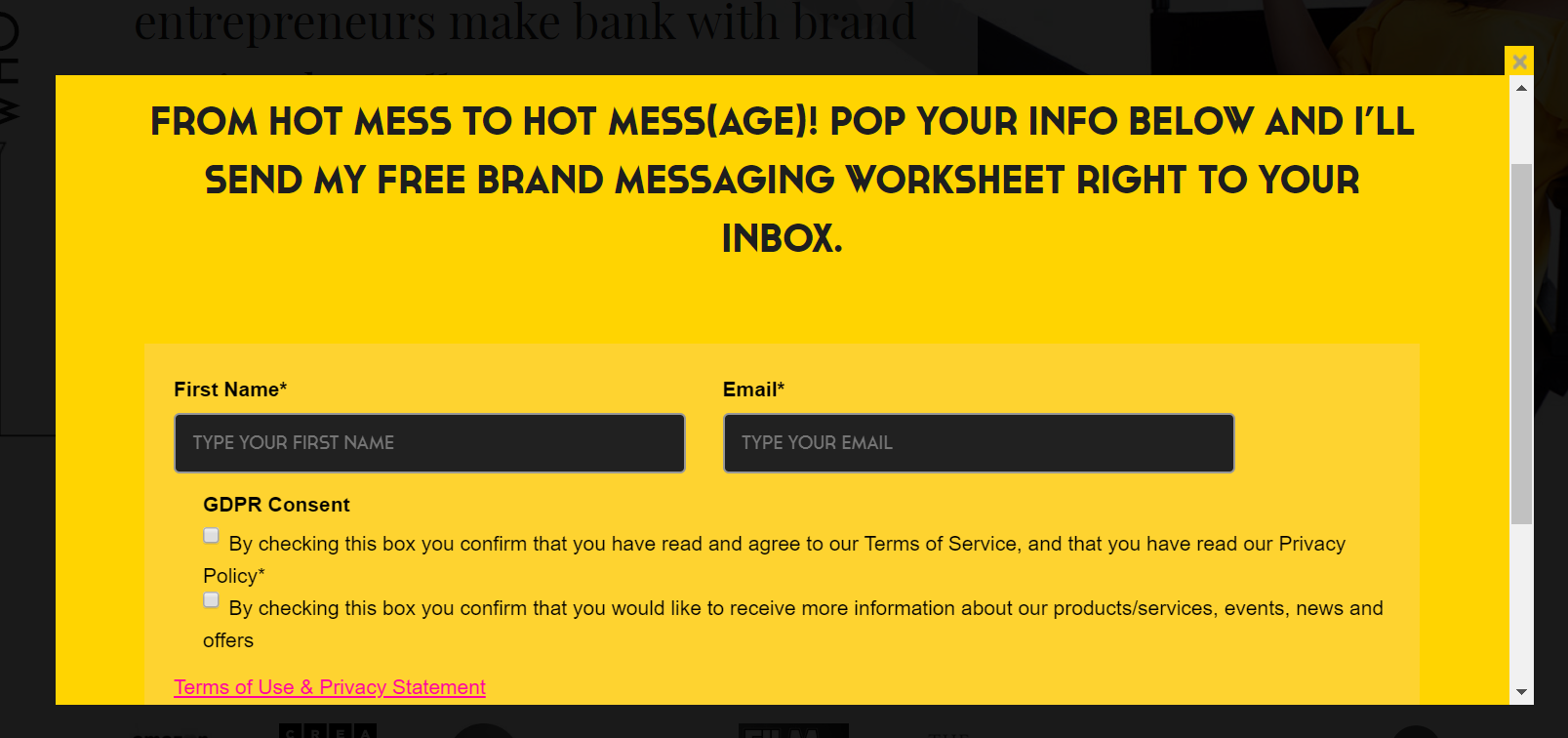
Show your personality
Showing your personality is actually often a make-or-break for your email opt-in forms. After all, nobody will invite you to their inbox if they don’t know you, don’t think you are an expert, and that you have actually something interesting or valuable to say:
Whether I sign up for someone’s newsletter is determined by whether I like the person, want their material, and am interested in what they’ve got to offer.
The design’s irrelevant if I don’t want what they’re offering or selling or it’s pitched incorrectly/doesn’t hook and follow through. The offer, and therefore the copy, trumps pretty pictures any day of the week.
– Russ Crowley, Technical Writer, Email Copywriter, and Microsoft Word Expert
This brings us to my next point: your value proposition.
Your Newsletter’s Value Proposition
- Make the benefits of signing up for your newsletter clear – what is the subscriber actually going to learn? What results will they get from this?
- To make it more convincing, refer to your own experience that led you to those results:
Offer a freebie
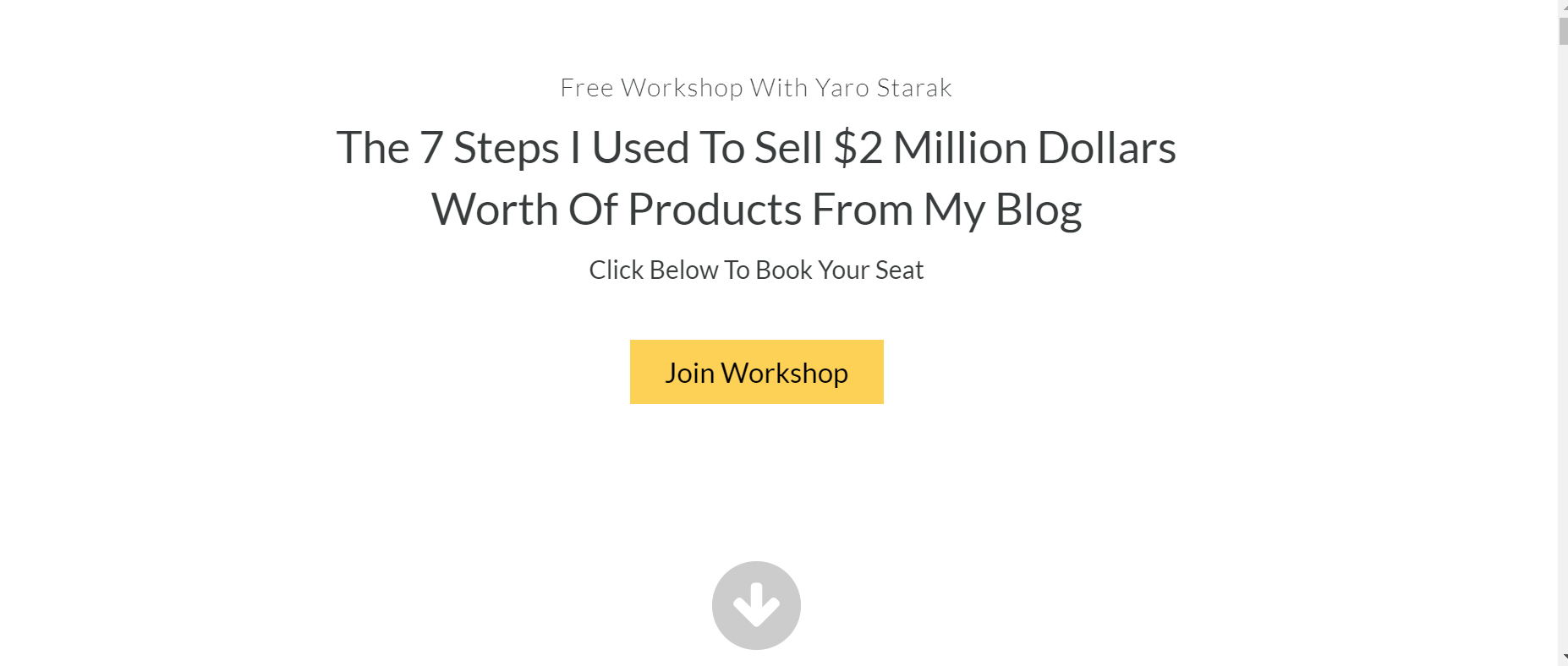
A tried-and-tested way to collect more subscribers is to offer them a downloadable asset (aka ‘lead magnet’ – e.g. a PDF, e-book, or white paper) as a ‘bribe’ for signing up for your newsletter. Here are some examples from Tim Ferris’s and Jaro Starak’s blogs:


From: Jaro Starak
Remember: the lead magnets need to still convey your value proposition and be relevant to your target audience.
Also: you need to make sure that your opt-in form is GDPR compliant if you’re offering a freebie as your lead magnet.
Also, as you can see from Cait Scudder’s opt-in form below – you don’t need to directly refer to your newsletter in your sign-up form. An interesting (and very effective!) alternative is to offer your audience to take part in a quiz. The quiz can ‘diagnose’ some problem they have, or the type of person they are. It will only ask them for an email (and newsletter sign-up!) after they have completed it – to receive the results.
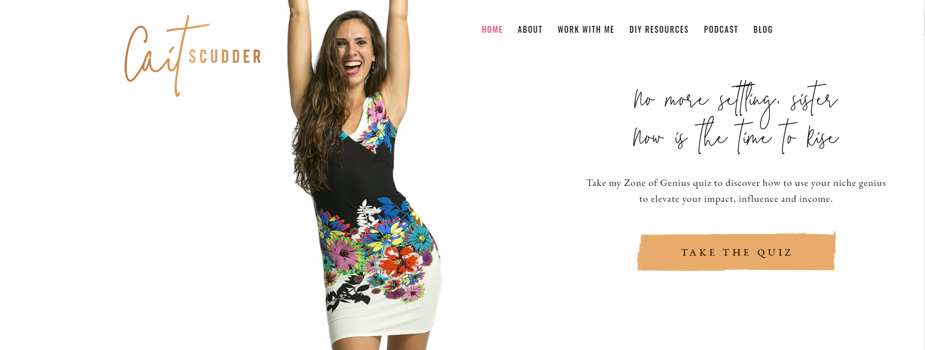
A great tool for creating quizzes as lead magnets is Interact.
Design of your email opt-in form
Now that we’ve discussed creating your opt-in copy, and what you need to consider – let’s move on to the design.
First, let’s consider the factors that affect your design.
Email Opt-in form location
Your email opt-in form can be either a stand-alone box on your home page or a blog post, or a part of your hero header on your home page.
Have consistent branding
Make sure the colors and fonts you use in your email opt-in match the visual identity of your brand.
Add Your Photo to your email Opt-in form

From: Dream Life Deluxe
A very powerful way to encourage your website visitors to sign up for your newsletter is to include a photo of yourself in your email opt-in form.
Why?
People are naturally drawn to human faces, so they will notice your opt-in form more quickly.
Also – adding your face adds personality to your email opt-in forms. You need to show your potential subscribers whom they are going to communicate with to persuade them to sign-up. After all, email marketing is about communication.
Have a button with a compelling CTA
Make sure the CTA in your email opt-in form is placed in a button. This is known to increase conversions and is the first thing your subscribers look at when considering your opt-in form.
Add GDPR fields ensuring privacy
Privacy is taken a lot more seriously than just a few years ago – and people are simply not willing to give it up
Since GDPR (General Data Protection Regulation) came into force in May 2018, it is required by law to inform your subscribers what exactly they are signing up for: whether you will be sending only informational content or marketing offers as well, who will be the data administrator of your subscribers’ personal data, etc.
This is especially important if the reason why your audience is signing up is to download a freebie, but you’re still planning to use their email to send them marketing newsletters:

Conclusion
If you want your email opt-in forms to bring you a constant stream of happy subscribers, bear the following in mind:
- Copy is king. Make sure to convey your newsletter’s value proposition in it, as well as your unique personality.
- Have a compelling CTA – and wrap it in a button.
- Use lead magnets such as free ebooks, webinars, etc. – to encourage your potential subscribers to sign up
- You don’t have to ask your audience to sign up for a newsletter in the email opt-in form just yet – especially if you offer them to take part in a quiz
- Use a photo of yourself in the opt-in form – to build trust and connection with your audience, and to attract their attention;
- Keep the opt-in consistent with your brand identity through the use of matching fonts and colors
- Above all, respect your subscribers’ privacy and make sure your email opt-in forms are GDPR compliant
Leave a Reply