In this fast-paced digital age, captivating your audience’s attention is more crucial than ever. Newsletters continue to be a powerful tool for connecting with readers and conveying valuable information. So making them appealing and engaging is essential.
Whether you’re a seasoned marketer or a small business owner, we’ve got you covered. This article will explore eight effective ways to make your virtual newsletter content stand out. Our guide will show you how to transform your emails into eye-catching masterpieces that leave a lasting impression.
But before we explore different strategies, it’s worth securing a trusted and verifiable domain name to send your newsletter from. This will ensure your emails land in subscribers’ inboxes, not their spam folders.
For example, if you’re a tech company or start-up, you could register io domain. A popular hack, this creates short and memorable extensions that can help companies in those sectors stand out.
Ready to discover how you can breathe new life into your newsletters? Let’s dive in!
Write Intriguing Subject Lines
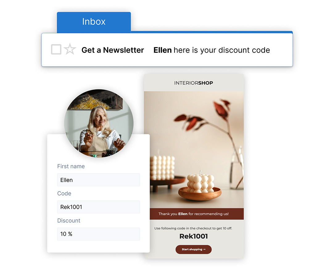
Crafting intriguing subject lines is an art that can significantly impact the success of your newsletters. It’s the first point of contact with your audience. Consider it the make-or-break moment that determines whether your email will be opened or ignored.
To stand out in people’s inboxes, focus on creating subject lines that spark curiosity and convey value. Use actionable language to entice readers into opening the email, such as “Unlock Exclusive Tips to Boost Your Productivity.” By highlighting benefits, you give recipients a compelling reason to read your newsletter from start to finish.
Moreover, incorporating a touch of personalization can make subject lines even more intriguing. Addressing your recipients by their names or referring to their previous interactions with your brand shows that you value them as an individual.
For example, an eCommerce company might promote signing up to their newsletter for exclusive discounts. This would help them generate leads and the customer would get a discount. The subject “John, Your Weekly Digest of Insider Deals Awaits!” creates a sense of exclusivity, which makes John more likely to open the email to see what’s in store for him.
Always keep your subject lines concise, clear, and relevant to the content inside the newsletter.
Personalize Your Newsletter
Personalizing your newsletter is a powerful way to make it more eye-catching and engaging for your audience. In a sea of generic emails, personalized content stands out and creates a stronger connection with your readers.
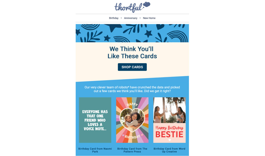
Start by segmenting your email list based on various factors such as location, interests, past interactions, or purchase history. By understanding your audience’s preferences, you can tailor the content to meet their specific needs and interests.
You can also collect more data from the user when they sign up to your newsletter, such as their name and phone number. However, keep in mind that by asking for more input, you include more friction when they sign up. This could make them less likely to be interested in your newsletter.
If you collect phone numbers, you can also use a text messaging service for business to contact your customers. This type of omnichannel marketing will improve your relationship with customers and increase open/conversion rates.
When personalizing your newsletter, go beyond addressing the recipient by name in the salutation. Use the data you have collected to deliver targeted content that speaks directly to each segment. For example, if you have an e-commerce store, recommend products related to their previous purchases or browsing history.
You can also share exclusive offers or discounts based on their loyalty status or website activity. By doing so, you demonstrate that you value each subscriber individually. They are then more likely to engage with content as it feels relevant and tailored to their preferences.
Another way to personalize your newsletter is by using dynamic content. With this approach, you can show different content blocks to different segments within the same email. For instance, you might display different images or call-to-actions based on a subscriber’s location or past behavior.
This level of personalization demonstrates that you know your audience and are willing to provide them with content that aligns with their unique needs and interests. This leads to increased engagement, customer loyalty, and ultimately, better results for your email marketing efforts.
Establish A Clear Hierarchy
A well-structured hierarchy guides readers’ attention and helps them grasp content quickly. Start with a strong, attention-grabbing main heading using larger fonts, bold, or contrasting colors to make it stand out.
Subheadings break down your newsletter into digestible sections, using slightly smaller fonts and bold/italic formatting. This clear hierarchy ensures seamless navigation and enhances content accessibility.
Keep Content Concise
Adding onto the previous point, when it comes to paragraphs, keep them short and focused. Walls of text can be overwhelming and lead readers to lose interest. Aim for around 2-3 sentences per paragraph or 4-5 lines to make the content more scannable.
Utilize bullet points or numbered lists when appropriate, as they present information in a concise and visually appealing manner. In addition, leave sufficient white space between sections. This gives your content room to breathe, making it more visually appealing and less cluttered.
Maintain Consistent Branding
As mentioned, domain extensions are brilliant for building your brand identity. For example, using a com.se extension for a Swedish site or an au domain for an Australian website makes your brand more recognizable.
But consistent visual content is also vital. It builds brand recognition, making it easier for readers to associate your newsletter with your business.
If you’ve ever done a website redesign, chances are you know the importance of creating a consistent look across the platform. Email newsletters are no different.
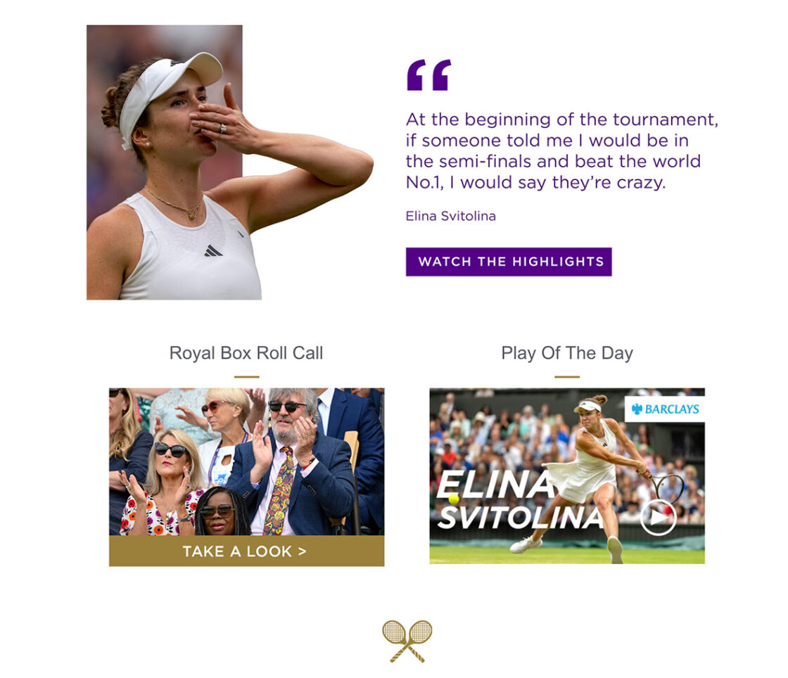
Use your brand’s colors and typography consistently in the main heading, subheadings, body text, and call-to-action buttons. This enhances visual appeal and creates familiarity for your audience.
Strategically use your brand’s logo at the top of the newsletter to reinforce recognition. Align the tone and voice with your brand personality and maintain a consistent writing style that reflects your values and messaging.
And, similarly to what you did when building your company’s website, ensuring consistent formatting to aid effortless navigation is crucial for your newsletters readers. Use the same layout in each edition for continuity and predictability. Keeping the layout consistent across all editions ensures readers can find information quickly in a familiar structure.
A consistent format not only makes your newsletter visually appealing but also improves its readability. By maintaining a consistent format, your newsletter becomes a polished representation of your brand, fostering trust and loyalty with your readers.
Optimize For Mobile
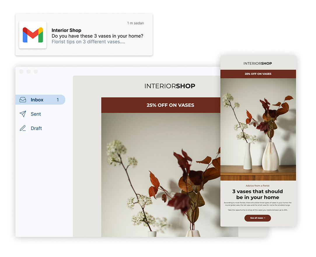
Optimizing your newsletters for phones is crucial in today’s mobile-centric world. With a significant portion of email opens happening on mobile devices, it’s essential to ensure that your newsletter looks stunning and functions flawlessly on smaller screens.
With that in mind, adopt a responsive design approach. This means that your newsletter layout automatically adapts to different screen sizes and orientations, providing an optimal viewing experience on different devices.
In addition, use a legible font size to ensure your text remains easily readable without zooming in. Opt for a font that’s not only visually appealing but also compatible with various mobile devices.
Mobile users appreciate a seamless experience. So make sure your call-to-action buttons are large enough and well-spaced to prevent accidental clicks. By optimizing for mobile phones, you ensure that your newsletters are visually appealing, user-friendly, and deliver an enjoyable experience, leading to higher engagement and conversions.
When creating your emails, testing is a significant part of the process. You must ensure all users can easily engage with your content.
Send drafts to your personal devices and view them in different formats. In addition, run your newsletter through the Global App Testing accessibility programme. Through this process, accredited testers will ensure your newsletter is optimized for impaired users.
Add Eye-catching Visuals
You might be sending out an email to promote sale items. Or perhaps you’re crafting an informative newsletter explaining how to fax from computer. Either way, adding images to these newsletters will boost visual appeal and engagement. Visuals effectively convey emotions, information, and brand messages beyond text.
Select relevant, high-quality images that resonate with your audience. They enhance the newsletter’s aesthetic and create a professional impression.
Strategically use images to break up text-heavy sections and add visual interest. You should illustrate key points, showcase products, and highlight customer testimonials.
Optimize image sizes for quick loading by compressing them, and include alt text for context if images don’t load properly.
Another effective way to make newsletters more eye-catching is by using animated images or GIFs. These dynamic elements can add a touch of interactivity and captivate readers’ attention.
Use GIFs to showcase product demonstrations, illustrate processes, or simply inject humor into your newsletter.
Create Clear Call-To-Actions
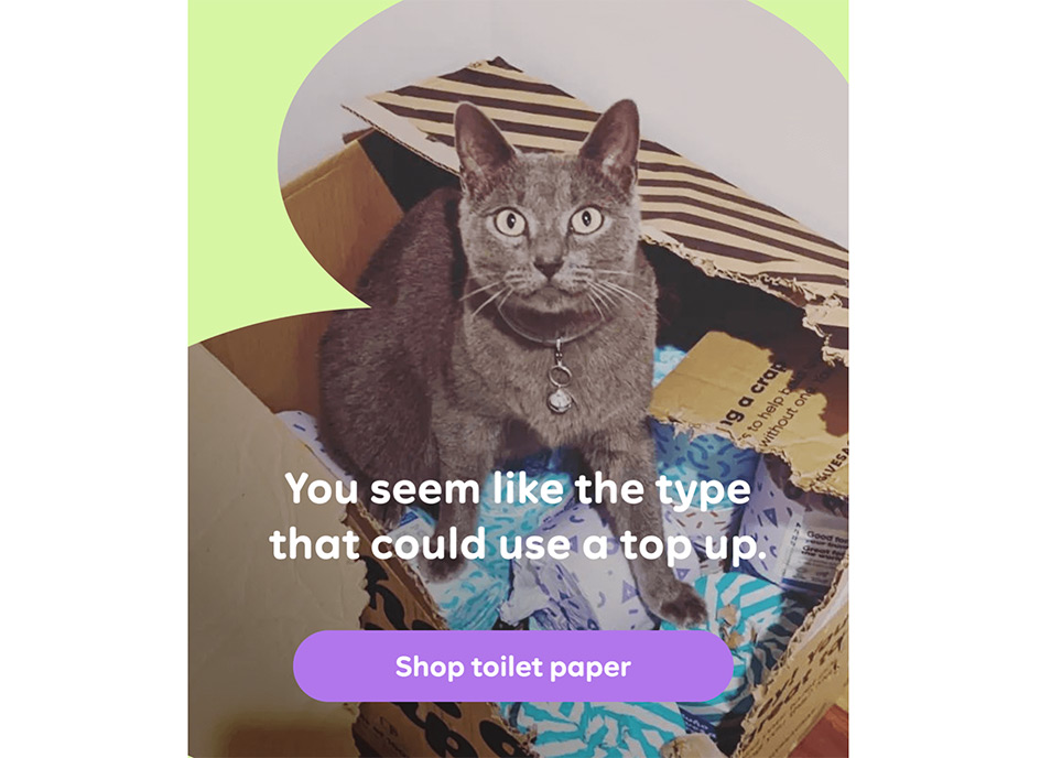
Your CTA should be straightforward and leave no room for ambiguity. Use action-oriented language that clearly communicates what you want your audience to do next. Whether it’s “Shop Now,” “Download the Guide,” or “Get Started,” make your CTA stand out with contrasting colors and prominent placement.
By making your CTA highly visible and easy to identify, you increase the likelihood of readers clicking through and engaging with your content.
Moreover, tailor your CTA to align with the specific content of your newsletter. For example, if your newsletter promotes a new product, the CTA should direct readers to the product page. Your CTA should seamlessly flow from the content and offer a natural next step for your audience.
Conclusion
Crafting eye-catching virtual newsletters is a blend of art and strategy.
By implementing the eight powerful techniques discussed in this article, you can transform your newsletters from ordinary to exceptional.
Get started with email marketing
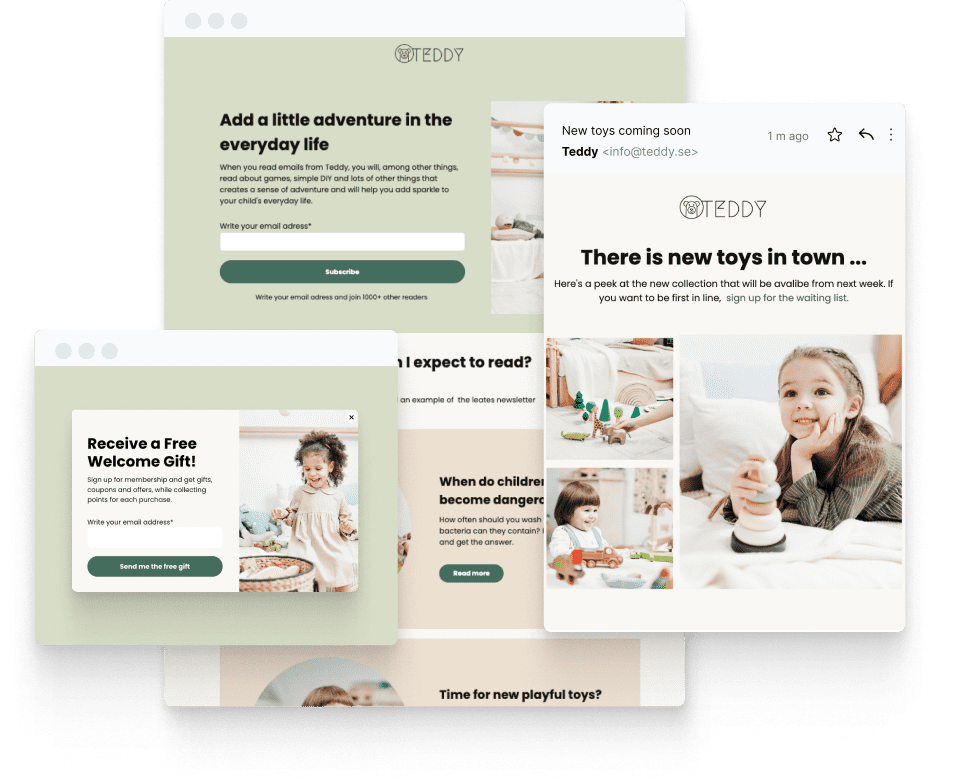
Create beautiful email newsletters for free with Get a Newsletter and reach your subscribers and customers in a heartbeat.
Leave a Reply