Landing pages are one of the most effective tools for generating leads and driving traffic to sales, yet companies don’t use them enough, or in some cases, not at all.
Some businesses argue that their website is sufficient enough and it is the one to prioritize. The problem is that most websites are not built and designed to convert their visitors optimally. Therefore there is a high chance of missing out on lots of leads and sales without companies or individuals knowing about it!
Why landing pages are so effective and have a higher conversion rate than regular websites is because they have only one purpose and goal – to get visitors to do what you want them to do.
So, how do you get started creating landing pages to get more leads and customers?
Follow along below while we’ll go through everything you need to know about how a landing page is structured and what you need to do to get started!
What should a landing page contain?
A landing page is usually a big part of a successful marketing campaign to convert your visitors into customers efficiently. For a landing page to be successful, it needs to be informative, engaging and provide visitors with a compelling user experience.
The advantage of landing pages is that they all follow a similar structure, regardless of your goal or target audience. You can be as creative as you want with your content and design structure as long as you follow the basic structure.
Once you understand how landing pages get built and what structure they should follow, you can start working outside the box and finding ways to optimize your landing pages toward even better results.
A good basic landing page structure contains five different elements:
- Unique selling point (USP)
- Images or videos
- Benefits & features
- Call-to-action
- Social proof
Let’s take a closer look at each element and why they’re crucial to include.
Unique selling point (USP)
A unique selling point allows you to tell your visitors what makes your product or service different from the competition.
Landing pages need to communicate this concisely and clearly to quickly capture visitors’ interest and encourage them to continue exploring your landing page and offer.
So where on a landing page should this information be?
The headline is the first thing visitors read and for that simple reason, this is the most optimal place to showcase your unique selling point.
Again, be concise and straight to the point with your main headline and unique selling point.
Don’t get too caught up with your USP has to be unique for the sake of being unique, as today it is difficult to be alone in anything, regardless of industry. Instead, think in terms of how you can communicate your unique selling point in a different way to your competitors and stand out from the crowd.
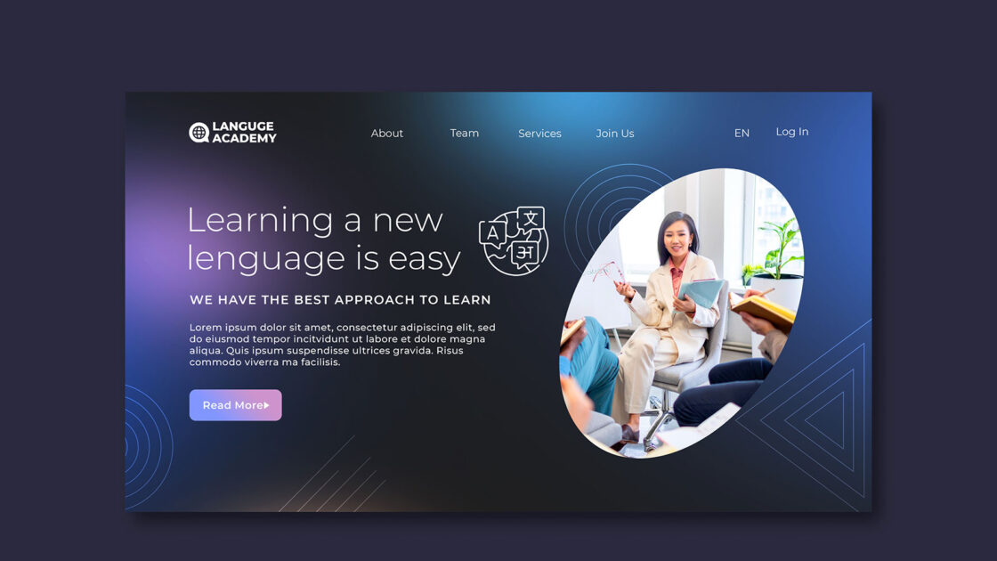
Images or videos
Visual content, such as images and videos, is very useful in capturing attention and helps to reinforce the landing page message and engagement with visitors.
Any image or video you use should be high-quality and relevant to your offer on the landing page. For example, if you run an e-commerce business, it could be stylishly showcasing a few products, or if you run yoga classes, it could be an image or video from an ongoing yoga class to inspire.
The advantage of visual content is that it conveys and evokes emotions in people in a better way than text can – take advantage of that opportunity!
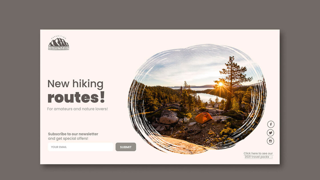
Benefits & Features
To get visitors to perform your desired action, you need to convince them that what you offer is something they need. In other words, you create a need in the visitors.
A great way to convince visitors is to tell them about the benefits and features of your product or service. The difference between a feature and a benefit is that a feature describes what your product or service does, while a benefit describes the value of what it provides.
The smartest thing to do is to showcase benefits and features together for the best result, but if you need to prioritize one, you should first tell the user what benefits your product or service provides.
Telling visitors about the benefits and features of your offering will also give them more detailed information and can answer any questions they may have.
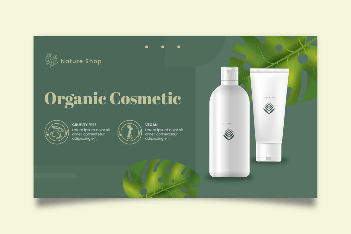
Call-to-action
The most crucial component of your landing page is your call-to-action (CTA). A call-to-action can be a button that redirects visitors to another page or a form to generate leads. It should be easy to find and be inviting to make visitors feel compelled to click the button or fill out the form.
Here are some tips on how to create good call-to-actions on your landing pages:
- Use a maximum of 4-5 words in buttons.
- Some say you should only use one call-to-action, and that’s not entirely true. You can use multiple call-to-actions on the same landing page as long they lead to the same conversion goal.
- Focus the text content of your call-to-actions on the value visitors get from performing your desired action.
- Guide visitors by telling them what to do and how the action is relevant to your offer. For example, “Download the guide” or “Get 30% off your purchase“.
- Avoid writing “Click here” or “Read more” in call-to-actions as it does not describe the value of your offer.
- Make sure there is a contrasting difference between your call-to-action and other content to make it stand out from the rest of the landing page and grab attention more easily.
- Make buttons big enough to make your call-to-action stand out more.
- Give your call-to-action enough space design-wise from other content to make it stand out more and not be one in the crowd.
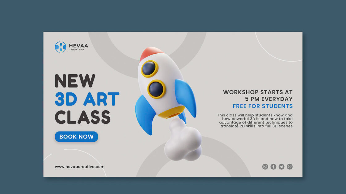
Social proof
By using social proof on a landing page, you can increase the credibility of your offer and build trust with potential customers.
There are many types of social proof, and what is best suited to your landing page is based on what material you have available to use or can create.
Examples of some social proof content:
- Client company logos
- Quotes from customers
- Direct customer reviews or reviews from other platforms
- Interviews in video form
- Case studies
Something important to keep in mind is not to create fake social proof. That could hurt you if you get caught out. If potential customers were to find out that you are making up social proof about yourself, you might lose their trust for a long time and will have a hard time winning them back.

How do I get started with landing pages?
Now that you understand the structure of a landing page, how do you get started and start building them?
A good start is to find a tool, such as Get a Newsletter, that makes it easy for you to create landing pages, regardless of your previous level of knowledge.
Explore our pre-made landing page templates and start building your very own landing pages to generate more leads and get more paying customers like other big companies!
Landing page templates
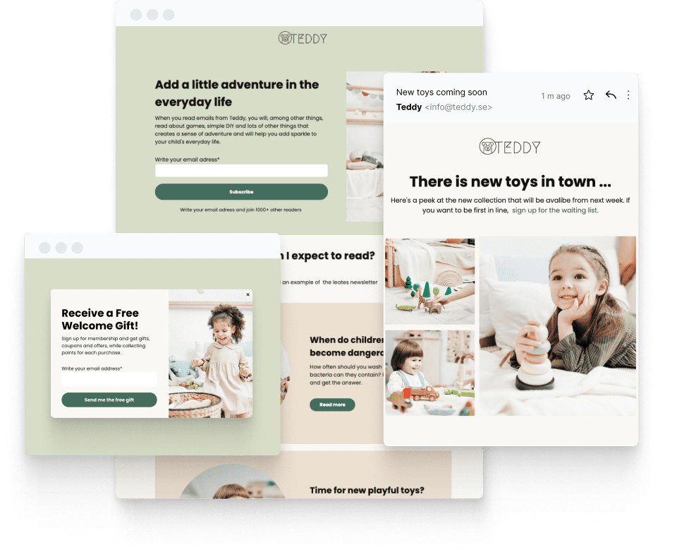
Start converting your visitors into paying customers with landing pages.
6 tips for making your landing pages better
1. Only ask for the information you need
If you have a form on your landing page and ask for too much information, it can be discouraging enough for your potential customers to fulfill it.
You should aim to collect as little information as possible and only ask for information you actually need based on what your product requires. In many cases, simply asking for the visitor’s email address in the form may be enough.
It may be tempting to ask for a lot of information in forms to learn more about your potential customers, but for every new piece of information you ask for, you create an extra step for visitors to go through. Therefore, your chances of them completing your forms decrease for every step you add.
2. Focus on delivering value
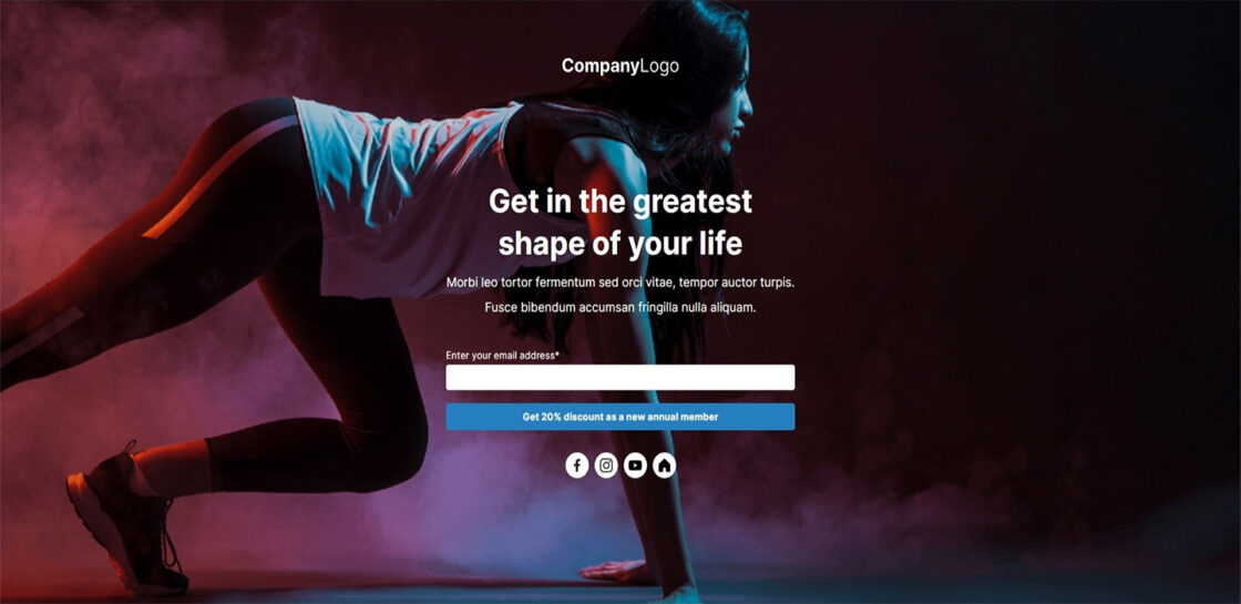
By focusing on delivering value on your landing pages, you can generate more leads and get potential customers further down the buying journey.
A couple of examples of great value could be offering a free trial, demo, or sample of your offer in return for visitors filling out your form. While using a landing page for “about us” or “contact us” doesn’t provide any value to the visitors and isn’t likely to generate any leads or sales.
What the actual value is to visitors and how you can best communicate it depends on the product you offer and can therefore look different from case to case. For example, if you are selling an expensive product, you can convince visitors more easily by explaining the value using a range of benefits the product provides to the user.

3. Be clear and concise in your communication
Make it easy for your visitors and be clear what your landing page is all about and what you want them to do.
You don’t want to give out too much information for the sake of it or have multiple messages on the same landing page. Doing so, you risk confusing visitors and lowering your chances of converting them – if you confuse, you’ll lose.
Also, try to keep the amount of information down and limit the use of text, images, and videos to what is only necessary for your specific offer.
It’s also a good idea to organize the content on your landing pages in a logical order so that visitors get information at the right time. If visitors get convinced by the information they read about your product or service, it will be easier for you to convert them using your call-to-action.
4. Don’t use a home page as a landing page
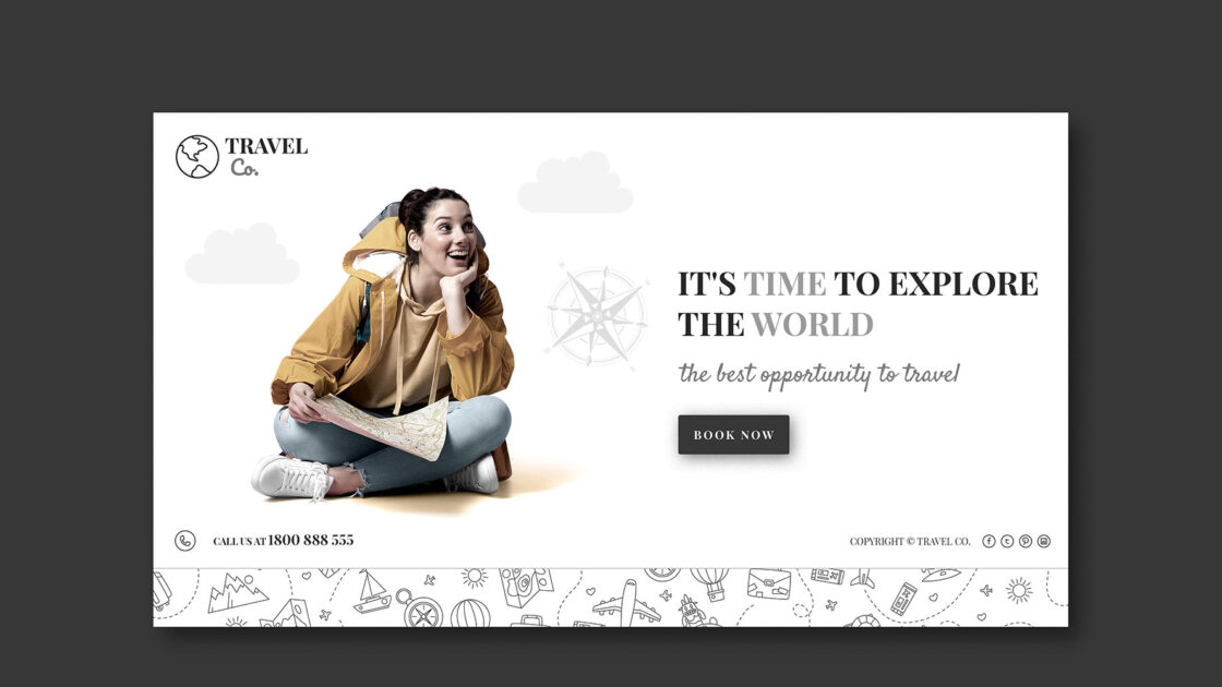
Homepages usually have many distractions where visitors can easily click through to other pages on your site and explore everything you offer. That makes it difficult for visitors to know what you want them to do, and therefore are not home pages ideal for creating conversions in most cases.
Using a dedicated landing page with a clear and focused conversion goal will help you convert visitors into leads or customers in a much more effective way, as visitors will have fewer distractions and have an easier time focusing on what you want them to do.

5. Remove navigation menus on your landing pages
Along the same lines as above, remove as many distractions as possible from your landing pages to make visitors stay longer on them.
Leaving navigation menus in the header and footer can generate a lot of curiosity and increase the chances that visitors will click through to other pages through them. For that reason, the best practice is to remove navigation menus from your landing pages so that visitors stay longer and continue to explore your offer.

6. Responsiveness & loading speed
A factor in getting your visitors to stay on your landing pages longer and perform the desired action is making sure the landing page is responsive to all devices and that the landing page has a fast loading speed.
Today, most searches on the internet are done on mobile devices than on computers, so you need to ensure that your landing page looks great for all devices to make all your channels conversion-friendly. This way, your campaigns will have the best chance of being successful and profitable.
Don’t forget to test your landing pages on different devices before you publish them so you can be sure they look good everywhere.
It’s also crucial that your landing page has a fast loading speed. According to Google, if a page takes up to 3 seconds to load, the chances of a user leaving your site increase by 32%, and if a page takes 5 seconds to load, it increases by a whopping 90%.
By using a fast and solid platform and not using large images and videos in your content, you can avoid long loading times and make visitors stay longer on your landing pages.
With Get a Newsletter, you get the best of both worlds, a stable and fast platform that compresses all the media you use on your landing pages, and a simple tool to customize them for responsiveness, win-win!
Are you ready to get more leads and paying customers with landing pages?
Take your digital marketing to new heights with the use of landing pages. Choose from over 25 templates to get started quickly or create your own landing page from scratch.
Get started with landing pages
Start a 14-day trial with Get a Newsletter and create your first landing page.


Leave a Reply